Showing posts with label typography. Show all posts

Sunday, October 30, 2011

Design Victory: Type for Dyslectics

Great short article on Fast Company’s Co.Design about a typeface designed for people with dyslexia designed by someone with dyslexia. Talk about user-centered design.

The face is awkward-looking by traditional visual typographic criteria, but using Louis Sullivan’s Form Follows Function criteria, it seems like a masterpiece. The article said it best:
If it works, it works. And according to an independent study by the University of Twente in Boer’s native Netherlands, it does work.
Amen.

For your next presentation: if, for any given population, approximately 5–10% have some sort of dyslexia and another 7–10% have some sort of color deficiency; that’s potentially 20% of your audience that doesn’t see things the way you do, literally. I’m exaggerating a bit, but try to consider all the ways your audience is different from you and your worldview.

Monday, April 18, 2011

Typographic Irony

(Hello again. Yes, it’s been a while.)

I noticed this bit of typographic irony this morning in an ABC World News Tonight promo. The typeface used in this graphic for their series “Made in America” is DIN, short for Deutsches Institut für Normung.

If that sounds not-so-American, you’re right. It’s a German typeface that goes back to the 1920’s, though this particular cut is probably from the 90’s.

Not a big deal. Really. But if one was concerned, there are some strong sans-serif faces whose pedigree is distinctly American. Franklin Gothic, for example. Or Gotham.

Still, a little appreciation of the history and tradition of one’s profession might be useful too, eh?

Friday, October 30, 2009

More legibility = less boldface

If you have single slides with lots of words on them (such as a paragraph), don’t use bold type. Or all capital letters. Or worse, combine them (bold all capitals). It makes your text very difficult to read.

Here’s why:

Roman (or normal or regular) type is designed to be read and is at the core of all text faces.* Bold type usually has less white space, both inside the letters and between letters, and so the letters visually blend together more than their roman counterparts. The result is big white or black perceptual masses with less distinct letter shapes, and so your readers need to slow down to recognize letters and words. And if your audience is spending more mental energy processing text shapes, that’s less mental energy available to pay attention to you and your message.

Traditional typography sets most text in roman type with italics and bold reserved for specific uses or headlines. (And bold italic faces were rarely seen before the 1980’s). These conventions exist because they work. Roman type is easier to read, especially in larger blocks of text. Even projected, medium weight letters read better than all bold ones.

Here’s another, more practical reason not to make your slides all bold, all the time (or all-cap, all bold, all the time – shudder). If you start with bold all-caps, how do you emphasize something? Make it bigger, brighter, even harder to read? There’s nothing left.

So, if you have slides with bunches of words that looks similar to paragraphs, then this applies to you:
  • If you are designing slides in PP to project to a large group, it would be best to remove most of the words from your slides. Then you can feel free to use bold for the remaining 4 words on the slide.
  • If you are designing a slideument (a document that will be printed and may be projected), please “unbold” all that bold type (you’ll use less toner when you print, too).
Your audience will thank you.

* Display faces – those that are not designed to be used for entire paragraphs of text – usually don’t have many variations, if any.

Thursday, September 3, 2009

Good type matters (part 6): dashes

Type is the single most important graphic element on most pages (or slides, or webpages, or emails).

Use En-dashes.

Admittedly this is bordering on the typographically compulsive, but I do feel it’s important to know the difference. In ordinary use, there are three kinds of dashes:
  • Hyphen. Technically a punctuation mark, it is the shortest of the three and the thing on your Qwerty keyboard next to the zero. ( - ) It is used for hyphenated words (duh) an to break words over multiple lines (a task often done by your computer, but the best results require some human intervention).
  • En-dash. A little longer than the hyphen (an en-space, to be exact), it is used in modern typography to set off phrases – use it with a normal word space on either side.
  • Em-dash. The so-called long dash—it is rarely used in modern typography. You may still see it used, but to quote Robert Bringhurst: “The em-dash is the nineteenth-century standard, still prescribed in many editorial style books, but the em-dash is too long for the best text faces. Like the oversized space between sentences, it belongs to the padded and corseted aesthetic of Victorian typography.”
Please note there is no double hyphen. The double hyphen was the typist’s indication when preparing manuscripts that a dash (probably an em-dash) should be set. Your typography will be more elegant if you unlearn this habit (or even easier, set Word and Powerpoint to replace “--” with “–” by going to Tools > Autocorrect > AutoFormat as You Type and select Symbol Characters with Symbols).

But as with quotation marks, consistency is more important than typographic rules. So if you are going to use double hyphens (or are assembling bits from people that do), then do so consistently. There are also times when a client or customer’s own style may call for using em-dashes instead of spaced en-dashes, so (obviously) one would follow the their style in such cases.

- - -

This is the last of these for now (I originally started with only three items). Typography is an art that some people study for a lifetime, and these suggestions are ridiculously simplified guidance for one minor aspect of it. Still, if the reader is interested in getting their audience to actually read what they write, these issues are a place to start. For those that want to know more, the de facto reference has become Robert Bringhurst’s The Elements of Typographic Style.

Saturday, August 22, 2009

Good type matters (part 5): quotation marks

Type is the most important blah blah blah ... (see my earlier posts).

Quotation marks.

This is both easy and complicated: use real quotation marks and apostrophes. This matters everywhere, but it really stands out in headlines and other large type. Quotation marks (both single and double) are a matched set, that is they have a front and back (or beginning and end). The things on your keyboard are prime and double prime marks, and they do not come as a set. There are regional variations on use (including using guillemets instead of quotation marks), and positioning differences (for instance, German traditionally uses opening quotes below the baseline instead of at the ascender), but all use different symbols to open and close a quotation.

“thus” (quotation marks, sometimes called curly quotes), not "this" (double prime marks, sometimes called straight quotes)

Ditto for apostrophes.

Adjust your software to use real quotation marks. And please don’t use too many of them (quotation marks “seem” to be “overused” so often there is a great “website” dedicated to their “overuse”).

The easy part is setting Word or PP to use so-called curly quotes. In both programs, Microsoft has cleverly hidden the control under Tools > AutoCorrect > AutoFormat As You Type: check the Straight Quotes with Smart Quotes box.

The complicated part is that many other pieces of software you encounter don’t have such nice features, and so when you type the " or ' characters, that’s what you get. Oh well, c’est la vie. If you’re compulsive, like me, there are ways around this (copying and pasting, using strange key combinations, etc.), but for most people this is probably too much to worry about.

Prime and double prime marks are used as abbreviations for feet and inches (I’m 5'11"), and for minutes and seconds of an arc (60" = 1°). They are also used in math and science. In any of these uses, quotation marks would be incorrect and silly-looking.

Wednesday, August 19, 2009

Good type matters (part 4): using tabs

Type is the most important graphic element on any page (printed, web, or other). It sends subtle but important signals to readers. Done well, it sends positive signals and reinforces your message; done poorly, it sends negative signals and confuses your message.

Tabs

Ok, tabs are really a layout issue, but you only encounter them using type, and using them poorly can waste huge amounts of time and create bad-looking pages. As a reminder, tabs are those things that you can use within bodies of text to align type (say, in columns). In some ways, tabs have been superseded by tables (tables can do the same alignment tricks and more), but there are lots of places where tabs still appear and make sense to use instead of a table. So here is the big point:

Set specific tabs to suit your specific needs
(or: don’t use the default tabs).

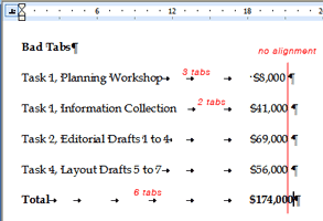
In Word and PP, you can set tabs based on your needs. For instance, if you have a list of items with prices for each, you could set a single decimal-aligned tab to align the column of numbers. What you should not do is keep hitting the tab key and adding spaces until things kinda-sorta line up.


So in our example, a list with two columns (an item and its price), each line should have only one tab character between the item and the price. The reason not to have multiple tab characters in-between columns is the same reason that you don’t want extra spaces in-between words – it usually looks bad and can screw up formatting down the line.

Notice how the numbers above don’t quite align. Sort of like a tie with a bad knot that isn’t straight – it just doesn’t look right.

To add tabs in Word and PP:

  • Make sure the ruler is visible (View > Ruler)
  • Highlight the text you want to add a tab to
  • Click the little tab button on the far left of the ruler to select the type of tab (left, center, right, or decimal)
  • Click on the ruler where you want the tab to be
  • To delete the tab, pull it down off the ruler


One other advantage of using tabs well: if you have to change the position of the column, you only need to change the position of a single tab (highlight all the lines, move the tab) instead of adding and deleting lots of individual spaces or tabs.

In my example above, I also added gray leader dots to guide the reader’s eye from the item to the price (an example of something you can’t do with tables).

Sunday, August 9, 2009

Good type matters (part 3): Spaces

The most important graphic element on any page (printed, web, or other) is type. It sends subtle but important signals to readers. Done well, it sends positive signals and reinforces your message; done poorly, it sends negative signals and confuses your message.

Businesses often use MS Word and Powerpoint to design countless communication pieces where type is often the only thing on the page (or screen). Applying some very basic typographic know-how can increase the legibility and effectiveness of those pieces. Today:

Spaces.

Horizontal space is just as important to legibility as vertical space. The biggest goofs I usually see about horizontal space involve spaces – too many of them.

Use one space after a period. Two spaces after a period is a holdover from the typewriter, but many are still taught to leave two spaces after a period. Good typography does not use two spaces after a period (or after any punctuation mark, for that matter). Searching for two spaces and replacing them with one is easily done in most software, but consistency is even more important. So, if you insist on using two spaces, then make sure all the periods are followed by two spaces (not one, or three, and five is right out).

Remove extra spaces. Extra spaces are another artifact of copying and pasting: they look bad, are distracting to readers, and can lead to some funky-looking paragraphs* (i.e., weird line breaks). Attention to detail will remove them. So can search-and-replace. To rid a document of all excess spaces in Word or PP (you may want to make a copy of the file in case you’re nervous):
  • Go to Edit > Replace
  • In the Find What field, carefully type two spaces
  • In the Replace With field, carefully type one space
  • Bravely click Replace All (seriously)
  • Repeat (you will need to repeat this process to clean out instances of three or more spaces in a row)
I know what you’re thinking – what about that place where I added 30 spaces to get things to line up or appear centered on the page? We’ll deal with that in the next episode: tabs.

- - -

* When I use the term paragraph, I mean it in a word-processing sense: any group of words before you hit the return key. For instance, each bullet list item above is a paragraph, or a floating label of six words in PP is also a paragraph.

Friday, July 31, 2009

Good Type Matters, Part 2: Leading

The most important graphic element on any page (printed, web, or other) is type. It sends subtle but important signals to readers.
  • Done well, it sends positive signals and reinforces your message.
  • Done poorly, it sends negative signals and confuses your message.
Businesses often use MS Word and Powerpoint to design countless communication pieces where type is often the only thing on the page (or screen). Applying some very basic typographic know-how can increase the legibility and effectiveness of those pieces.

In this post:

Line spacing (leading).

Leading is the space in between lines (so called because in the very old days, typographers would need to add thin strips of lead in between lines of type).

Here is the basic rule for most non-designers in ordinary business:

Err on the side of greater line spacing.

Bad line spacing is a giveaway that no one has paid attention to legibility, and it usually makes your type more difficult for people to read. So why would anyone do it?

The correct leading gives readers little channels for their eye to follow to the next line – the closer lines are together, the harder it is to get to the next line (and so legibility decreases). Typical leading is at least 120% of the type size for a normal width paragraph (such as that set in a newspaper or book), so 10-point type might have 12-point leading* (spacing). But, as lines get longer (the width of the paragraph), the space in-between needs to increase to give readers a clear route back across the page (or screen), so the same 10-point type might need 14- or even 20-point leading to make sure the paragraph is comfortable for the reader. Negative leading (i.e., 10-point type with 8-point leading) is never a good idea for regular text. Never, never, never. So, if your paragraph (or even as few as two lines) look squished, you are slowing your readers down and making them work harder. Don’t do it.

If adding more space makes the report or presentation longer and you want to limit the length or amount of pages, editing is the answer, not making more type more difficult to read.

- - - -

* Technically, this would be 2 points of leading (10-point type + 2-points leading = 12-point spacing from line to line). I use the term spacing hear because office applications refer to inter-line spacing that way, not as leading.

Sunday, July 26, 2009

Good Type Matters, Part 1

(First in a series.)

The most important graphic element on any page (printed, web, or other) is type. It sends subtle but important signals to readers.
  • Done well, it sends positive signals and reinforces your message.
  • Done poorly, it sends negative signals and confuses your message.
Businesses often use MS Word and Powerpoint to design countless communication pieces where type is often the only thing on the page (or screen). Applying some very basic typographic know-how can increase the legibility and effectiveness of those pieces. Today’s topic:

Use the same font.

I know it sounds obvious, but when you copy-and-paste from lots of different sources, it’s easy to end up with three or four similar typefaces in the same letter, or slide, or paragraph, or sentence (I’ve seen each). Though subtle, people pick up on this and it leaves an unflattering impression. It’s sort of like mismatched socks or wearing two different browns that just don’t go together – people notice, even if they can’t readily identify it. For example, Palatino (aka Book Antiqua) and Times New Roman look similar, but not alike:

Hamburgerfons Hamburgerfons

Add a line of Helvetica (or worse, Arial) and a callout in Verdana, and you have the makings of a really moshed-together slide (or letter, or report, or email).

Hamburgerfons Hamburgerfons

Does it change what you are saying? Well, yes it does. In the same way that an ill-fitting suit or bad manners detracts from your message, bad typography like this says “I really don’t care about the details”, or worse, “I didn’t notice them.” Is that what you want to say to current and future clients? (I didn’t think so.)

One way to avoid this is to always use Paste > Special > Plain Text, but that’s not practical, so you’ll just need to remember to pay extra attention to fonts as you copy-and-paste (and reapply the style or font to the text in question to be sure).

Next time: line spacing (leading).

Tuesday, July 7, 2009

The subway, Helvetica, and graphic standards

I recently read a fairly long, very-well researched article on how Helvetica became the typeface of the New York subway.

While the article may only be of interest to typographers and designers, those that would suggest that brute force application of simple templates or clever computer trickery will address an organization’s graphic consistency might invest the time to read it. The article is an excellent review of the real-world challenges of implementing even modest graphic standards, and goes into the complex subtleties of applying uniform ideas to fluid and localized conditions.

As a distantly-related side note, the typographer in me reminds the reader that Arial ≠ Helvetica (more on that elsewhere).