Like many people who work at the intersection of design, media, and technology, I am very sad to hear of Steve’s death. Though I never met the man, right now I feel like I have lost a mentor and inspirational friend.
I first started using a Mac in 1986, with some new-fangled programs called PageMaker and Adobe Illustrator. I was a designer and typographer and thought I had no use for a computer – until I used a Macintosh.
And since then, I have seen and participated in almost every communication technology wave (always on the disruptive side – go figure). Most follow a pattern: old-timers pointing out shortcomings in the new technology, established players protecting their turf, up-and-comers trying new tools and techniques, old eventually giving way to new. And through each, I imagine Steve giggling because he saw it coming and loved to create great products that would help enable the new in ways that even he couldn’t imagine.
I am not a religious man, but I hope wherever Steve is now he is at peace, and smiling at the world he has most certainly made a dent in.
Showing posts with label design. Show all posts
Showing posts with label design. Show all posts
Thursday, October 6, 2011

Monday, January 10, 2011
My Grandfather’s Map
 For Christmas, my mother gave me one of the most meaningful gifts I have received for some time. She had framed a map my grandfather drew when he was in his Tertia year at Penn Charter (the 1915-1916 school year, I think). I get weepy when I really think about it.
Though he was only around 15 when he drew it, it shows an attention to detail and craftsmanship that I have always associated with my grandfather, and also reminded me why I think making real things is so important.
Some disclaimers:
- I loved my grand-pop and have long considered him to be the spiritual source from which both my father and I inherited our respect of and devotion to making well-constructed things. (My wife probably labels this trait as compulsive and occasionally annoying. Sorry Hun.)
- I love steel pen-and-ink drawings. The line weight variations that are introduced as one changes pressure on the nib are a wonderful artifact that says a human being has made this.
- I love cartography and maps – the more detailed and well-designed the better. They may be one of the last graphic forms where the combination of good design and good printing yield something that just cannot be duplicated electronically.

You can’t read it on the image, but the title (in carefully lettered capitals) is Historical Map of the British Isles. It documents Heptarchy boundaries (I had to look that up), Roman roads, battles, and treaties. I assume it was done as part of a history study.
This map required homework and some serious thinking to execute – no Google Maps in 1915. For example, look at the latitude lines. If you had to draw a smooth, thin, shallow, 12-inch long arc with pen-and-ink today, how would you do it? (The map is about 12 x 18 inches.) You may not be able to tell, but the latitude lines are very thin and very smooth. And this is a 15-year old kid.
Ok, here’s the point…
This sort of thing matters today too. Everyone has Powerpoint and everyone can draw boxes and arrows and lines. And we know that everyone can add bullets galore. But evidence suggests that not everyone can draw a useful diagram, or construct a meaningful 2x2 model. And giving a presentation with really good typography and well-crafted graphics is a rarity.
Details matter.
I’m not sure if you can test for it, but the really good presentations that are continually referenced (Jobs, MLK, Godin, Gore, etc.) all reflect really good craftsmanship – these people pay attention to lots of details. And you should too, especially if your presentation includes tangible stuff like on-screen slides or paper handouts.
It doesn’t matter if you’re building a deck, carving a turkey, or drawing a map, paying attention to the details matter.
Thursday, November 18, 2010
Good photos = useful ones
Jakob Nielsen’s latest research shows that users pay close attention to photos and other images that contain relevant information but ignore fluffy pictures used to “jazz up” Web pages.
Seems to me this also applies to presentations:
(I’m sure I have drastically over-simplified things, but this just seems so inline with Tufte, Raskin, earlier Nielsen, etc.)
Seems to me this also applies to presentations:
- Maximize use of images that carry relevant information.
- Minimize images that are just there to be pretty.
(I’m sure I have drastically over-simplified things, but this just seems so inline with Tufte, Raskin, earlier Nielsen, etc.)
Monday, September 14, 2009
Steve Jobs on design
Came across this last week from a 1996 interview by Gary Wolf in Wired magazine (more than 15 years ago). A classic.
- - -
You have a reputation for making well-designed products. Why aren’t more products made with the aesthetics of great design?
Design is a funny word. Some people think design means how it looks. But of course, if you dig deeper, it’s really how it works. The design of the Mac wasn’t what it looked like, although that was part of it. Primarily, it was how it worked. To design something really well, you have to get it. You have to really grok what it’s all about. It takes a passionate commitment to really thoroughly understand something, chew it up, not just quickly swallow it. Most people don’t take the time to do that.
Creativity is just connecting things. When you ask creative people how they did something, they feel a little guilty because they didn’t really do it, they just saw something. It seemed obvious to them after a while. That’s because they were able to connect experiences they’ve had and synthesize new things. And the reason they were able to do that was that they’ve had more experiences or they have thought more about their experiences than other people.
Unfortunately, that’s too rare a commodity. A lot of people in our industry haven’t had very diverse experiences. So they don’t have enough dots to connect, and they end up with very linear solutions without a broad perspective on the problem. The broader one’s understanding of the human experience, the better design we will have.
Is there anything well designed today that inspires you?
Design is not limited to fancy new gadgets. Our family just bought a new washing machine and dryer. We didn’t have a very good one so we spent a little time looking at them. It turns out that the Americans make washers and dryers all wrong. The Europeans make them much better – but they take twice as long to do clothes! It turns out that they wash them with about a quarter as much water and your clothes end up with a lot less detergent on them. Most important, they don’t trash your clothes. They use a lot less soap, a lot less water, but they come out much cleaner, much softer, and they last a lot longer.
We spent some time in our family talking about what’s the trade-off we want to make. We ended up talking a lot about design, but also about the values of our family. Did we care most about getting our wash done in an hour versus an hour and a half? Or did we care most about our clothes feeling really soft and lasting longer? Did we care about using a quarter of the water? We spent about two weeks talking about this every night at the dinner table. We’d get around to that old washer-dryer discussion. And the talk was about design.
We ended up opting for these Miele appliances, made in Germany. They’re too expensive, but that’s just because nobody buys them in this country. They are really wonderfully made and one of the few products we’ve bought over the last few years that we’re all really happy about. These guys really thought the process through. They did such a great job designing these washers and dryers. I got more thrill out of them than I have out of any piece of high tech in years.
- - -
You have a reputation for making well-designed products. Why aren’t more products made with the aesthetics of great design?
Design is a funny word. Some people think design means how it looks. But of course, if you dig deeper, it’s really how it works. The design of the Mac wasn’t what it looked like, although that was part of it. Primarily, it was how it worked. To design something really well, you have to get it. You have to really grok what it’s all about. It takes a passionate commitment to really thoroughly understand something, chew it up, not just quickly swallow it. Most people don’t take the time to do that.
Creativity is just connecting things. When you ask creative people how they did something, they feel a little guilty because they didn’t really do it, they just saw something. It seemed obvious to them after a while. That’s because they were able to connect experiences they’ve had and synthesize new things. And the reason they were able to do that was that they’ve had more experiences or they have thought more about their experiences than other people.
Unfortunately, that’s too rare a commodity. A lot of people in our industry haven’t had very diverse experiences. So they don’t have enough dots to connect, and they end up with very linear solutions without a broad perspective on the problem. The broader one’s understanding of the human experience, the better design we will have.
Is there anything well designed today that inspires you?
Design is not limited to fancy new gadgets. Our family just bought a new washing machine and dryer. We didn’t have a very good one so we spent a little time looking at them. It turns out that the Americans make washers and dryers all wrong. The Europeans make them much better – but they take twice as long to do clothes! It turns out that they wash them with about a quarter as much water and your clothes end up with a lot less detergent on them. Most important, they don’t trash your clothes. They use a lot less soap, a lot less water, but they come out much cleaner, much softer, and they last a lot longer.
We spent some time in our family talking about what’s the trade-off we want to make. We ended up talking a lot about design, but also about the values of our family. Did we care most about getting our wash done in an hour versus an hour and a half? Or did we care most about our clothes feeling really soft and lasting longer? Did we care about using a quarter of the water? We spent about two weeks talking about this every night at the dinner table. We’d get around to that old washer-dryer discussion. And the talk was about design.
We ended up opting for these Miele appliances, made in Germany. They’re too expensive, but that’s just because nobody buys them in this country. They are really wonderfully made and one of the few products we’ve bought over the last few years that we’re all really happy about. These guys really thought the process through. They did such a great job designing these washers and dryers. I got more thrill out of them than I have out of any piece of high tech in years.
Sunday, September 6, 2009
Japanese Industrial Design
Reading about the new Mac OS – how it’s a lot of under-the-hood improvements but not many sexy new features – I got thinking about this from Wired, September 2001:
“In Japanese design, every little part, every little line, every little button is well thought-out. It’s as if each element is saying, ‘I am a part of this machine and I have to do my job, too, no matter how small.’ Next year’s model may not seem new, but it’s improved. And it’s not just consumer electronics. Look at a company like Honda. They’ll make a convertible sports coupe that could eat a Porsche Boxster alive on the racetrack, but it will look like a slightly pointy Civic. As a culture they’re not necessarily choosing to innovate: They choose to perfect.”Eight years later it still seems to be true.Gray Holland is part of the brain trust at frog design, the firm responsible for everything from Apple’s early look and feel to the new Ford Th!nk, an all-electric concept vehicle.
Tuesday, August 25, 2009
Intentional smudge
I used to know an illustrator who described how he would add a smudge to some inconsequential area of an illustration because he knew art directors (his clients) would always want to change something, so he gave them a target. I called this the intentional smudge and have discussed it with clients and used it myself from time to time.
I was amused to see Seth’s latest post discuss the same basic principle.
Both are good ways to help keep important ideas intact through the rigors of most approval processes. Of course, that assumes the stuff is worth keeping.
I was amused to see Seth’s latest post discuss the same basic principle.
Both are good ways to help keep important ideas intact through the rigors of most approval processes. Of course, that assumes the stuff is worth keeping.
Thursday, August 20, 2009
LO Presentations
I just sat through another LO presentation (Lost Opportunity). It could have been interesting, even emotional and moving. Alas, it was ordinary and message-less.
It’s not that there wasn’t information in it (there was plenty), it’s that it lacked a core message – nothing that we (the audience) needed to know, believe, or question. I still don’t know what the problem was, why I should care about it, and what, if anything, I’m supposed to do about it. A lost opportunity.
It is frustrating to participate (or at least be the passive audience) in these events, and it is reasonably easy to avoid with a smidge of planning.
For most sorts of communications, before you open any software, get a single piece of paper and writing device (seriously, don’t open Word):
It’s not that there wasn’t information in it (there was plenty), it’s that it lacked a core message – nothing that we (the audience) needed to know, believe, or question. I still don’t know what the problem was, why I should care about it, and what, if anything, I’m supposed to do about it. A lost opportunity.
It is frustrating to participate (or at least be the passive audience) in these events, and it is reasonably easy to avoid with a smidge of planning.
For most sorts of communications, before you open any software, get a single piece of paper and writing device (seriously, don’t open Word):
- Who is the audience(s) for this?
- What is the problem or issue?
- Why is it important (to that audience)?
- How does it impact them? (If it doesn't impact them, why should they care?)
- What (if anything) can they do about it? (If they can’t really do anything, why should they care?)
Wednesday, August 19, 2009
Good type matters (part 4): using tabs
Type is the most important graphic element on any page (printed, web, or other). It sends subtle but important signals to readers. Done well, it sends positive signals and reinforces your message; done poorly, it sends negative signals and confuses your message.
Tabs
Ok, tabs are really a layout issue, but you only encounter them using type, and using them poorly can waste huge amounts of time and create bad-looking pages. As a reminder, tabs are those things that you can use within bodies of text to align type (say, in columns). In some ways, tabs have been superseded by tables (tables can do the same alignment tricks and more), but there are lots of places where tabs still appear and make sense to use instead of a table. So here is the big point:
Set specific tabs to suit your specific needs
(or: don’t use the default tabs).
In Word and PP, you can set tabs based on your needs. For instance, if you have a list of items with prices for each, you could set a single decimal-aligned tab to align the column of numbers. What you should not do is keep hitting the tab key and adding spaces until things kinda-sorta line up.
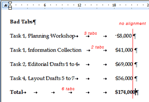
So in our example, a list with two columns (an item and its price), each line should have only one tab character between the item and the price. The reason not to have multiple tab characters in-between columns is the same reason that you don’t want extra spaces in-between words – it usually looks bad and can screw up formatting down the line.
Notice how the numbers above don’t quite align. Sort of like a tie with a bad knot that isn’t straight – it just doesn’t look right.
To add tabs in Word and PP:
- Make sure the ruler is visible (View > Ruler)
- Highlight the text you want to add a tab to
- Click the little tab button on the far left of the ruler to select the type of tab (left, center, right, or decimal)
- Click on the ruler where you want the tab to be
- To delete the tab, pull it down off the ruler

One other advantage of using tabs well: if you have to change the position of the column, you only need to change the position of a single tab (highlight all the lines, move the tab) instead of adding and deleting lots of individual spaces or tabs.
In my example above, I also added gray leader dots to guide the reader’s eye from the item to the price (an example of something you can’t do with tables).
Thursday, August 13, 2009
ecofont
Here’s an interesting twist on reducing your carbon footprint: ecofont.

A Dutch communications firm has designed a font with little holes in it to use less toner. Less toner means (in theory) your toner cartridge lasts longer and you can feel good about doing some little bit for the planet. I guess.
I’m not sure that poking holes in Verdana is necessarily great type design, but it does raise a valid point on printing and toner consumption. Bold colors and big photos look great onscreen but they do require a lot more toner to print, and that toner ultimately ends up somewhere. Even if you (or your customer, or your friends, or wherever your toner-based printed material ends up) recycle the paper, polymer-based toners are more difficult and usually require more energy to deink than their organic-based counterparts (i.e., ink).
Toner-based digital printing does offer advantages over traditional printing, but it’s also worthwhile considering the environmental impact of using so much toner.
A Dutch communications firm has designed a font with little holes in it to use less toner. Less toner means (in theory) your toner cartridge lasts longer and you can feel good about doing some little bit for the planet. I guess.
I’m not sure that poking holes in Verdana is necessarily great type design, but it does raise a valid point on printing and toner consumption. Bold colors and big photos look great onscreen but they do require a lot more toner to print, and that toner ultimately ends up somewhere. Even if you (or your customer, or your friends, or wherever your toner-based printed material ends up) recycle the paper, polymer-based toners are more difficult and usually require more energy to deink than their organic-based counterparts (i.e., ink).
Toner-based digital printing does offer advantages over traditional printing, but it’s also worthwhile considering the environmental impact of using so much toner.
Sunday, August 9, 2009
Good type matters (part 3): Spaces
The most important graphic element on any page (printed, web, or other) is type. It sends subtle but important signals to readers. Done well, it sends positive signals and reinforces your message; done poorly, it sends negative signals and confuses your message.
Businesses often use MS Word and Powerpoint to design countless communication pieces where type is often the only thing on the page (or screen). Applying some very basic typographic know-how can increase the legibility and effectiveness of those pieces. Today:
Spaces.
Horizontal space is just as important to legibility as vertical space. The biggest goofs I usually see about horizontal space involve spaces – too many of them.
Use one space after a period. Two spaces after a period is a holdover from the typewriter, but many are still taught to leave two spaces after a period. Good typography does not use two spaces after a period (or after any punctuation mark, for that matter). Searching for two spaces and replacing them with one is easily done in most software, but consistency is even more important. So, if you insist on using two spaces, then make sure all the periods are followed by two spaces (not one, or three, and five is right out).
Remove extra spaces. Extra spaces are another artifact of copying and pasting: they look bad, are distracting to readers, and can lead to some funky-looking paragraphs* (i.e., weird line breaks). Attention to detail will remove them. So can search-and-replace. To rid a document of all excess spaces in Word or PP (you may want to make a copy of the file in case you’re nervous):
- - -
* When I use the term paragraph, I mean it in a word-processing sense: any group of words before you hit the return key. For instance, each bullet list item above is a paragraph, or a floating label of six words in PP is also a paragraph.
Businesses often use MS Word and Powerpoint to design countless communication pieces where type is often the only thing on the page (or screen). Applying some very basic typographic know-how can increase the legibility and effectiveness of those pieces. Today:
Spaces.
Horizontal space is just as important to legibility as vertical space. The biggest goofs I usually see about horizontal space involve spaces – too many of them.
Use one space after a period. Two spaces after a period is a holdover from the typewriter, but many are still taught to leave two spaces after a period. Good typography does not use two spaces after a period (or after any punctuation mark, for that matter). Searching for two spaces and replacing them with one is easily done in most software, but consistency is even more important. So, if you insist on using two spaces, then make sure all the periods are followed by two spaces (not one, or three, and five is right out).
Remove extra spaces. Extra spaces are another artifact of copying and pasting: they look bad, are distracting to readers, and can lead to some funky-looking paragraphs* (i.e., weird line breaks). Attention to detail will remove them. So can search-and-replace. To rid a document of all excess spaces in Word or PP (you may want to make a copy of the file in case you’re nervous):
- Go to Edit > Replace
- In the Find What field, carefully type two spaces
- In the Replace With field, carefully type one space
- Bravely click Replace All (seriously)
- Repeat (you will need to repeat this process to clean out instances of three or more spaces in a row)
- - -
* When I use the term paragraph, I mean it in a word-processing sense: any group of words before you hit the return key. For instance, each bullet list item above is a paragraph, or a floating label of six words in PP is also a paragraph.
Friday, July 31, 2009
Good Type Matters, Part 2: Leading
The most important graphic element on any page (printed, web, or other) is type. It sends subtle but important signals to readers.
In this post:
Line spacing (leading).
Leading is the space in between lines (so called because in the very old days, typographers would need to add thin strips of lead in between lines of type).
Here is the basic rule for most non-designers in ordinary business:
Bad line spacing is a giveaway that no one has paid attention to legibility, and it usually makes your type more difficult for people to read. So why would anyone do it?
The correct leading gives readers little channels for their eye to follow to the next line – the closer lines are together, the harder it is to get to the next line (and so legibility decreases). Typical leading is at least 120% of the type size for a normal width paragraph (such as that set in a newspaper or book), so 10-point type might have 12-point leading* (spacing). But, as lines get longer (the width of the paragraph), the space in-between needs to increase to give readers a clear route back across the page (or screen), so the same 10-point type might need 14- or even 20-point leading to make sure the paragraph is comfortable for the reader. Negative leading (i.e., 10-point type with 8-point leading) is never a good idea for regular text. Never, never, never. So, if your paragraph (or even as few as two lines) look squished, you are slowing your readers down and making them work harder. Don’t do it.
If adding more space makes the report or presentation longer and you want to limit the length or amount of pages, editing is the answer, not making more type more difficult to read.
- - - -
* Technically, this would be 2 points of leading (10-point type + 2-points leading = 12-point spacing from line to line). I use the term spacing hear because office applications refer to inter-line spacing that way, not as leading.
- Done well, it sends positive signals and reinforces your message.
- Done poorly, it sends negative signals and confuses your message.
In this post:
Line spacing (leading).
Leading is the space in between lines (so called because in the very old days, typographers would need to add thin strips of lead in between lines of type).
Here is the basic rule for most non-designers in ordinary business:
Err on the side of greater line spacing.
Bad line spacing is a giveaway that no one has paid attention to legibility, and it usually makes your type more difficult for people to read. So why would anyone do it?
The correct leading gives readers little channels for their eye to follow to the next line – the closer lines are together, the harder it is to get to the next line (and so legibility decreases). Typical leading is at least 120% of the type size for a normal width paragraph (such as that set in a newspaper or book), so 10-point type might have 12-point leading* (spacing). But, as lines get longer (the width of the paragraph), the space in-between needs to increase to give readers a clear route back across the page (or screen), so the same 10-point type might need 14- or even 20-point leading to make sure the paragraph is comfortable for the reader. Negative leading (i.e., 10-point type with 8-point leading) is never a good idea for regular text. Never, never, never. So, if your paragraph (or even as few as two lines) look squished, you are slowing your readers down and making them work harder. Don’t do it.
If adding more space makes the report or presentation longer and you want to limit the length or amount of pages, editing is the answer, not making more type more difficult to read.
- - - -
* Technically, this would be 2 points of leading (10-point type + 2-points leading = 12-point spacing from line to line). I use the term spacing hear because office applications refer to inter-line spacing that way, not as leading.
Sunday, July 26, 2009
Good Type Matters, Part 1
(First in a series.)
The most important graphic element on any page (printed, web, or other) is type. It sends subtle but important signals to readers.
Use the same font.
I know it sounds obvious, but when you copy-and-paste from lots of different sources, it’s easy to end up with three or four similar typefaces in the same letter, or slide, or paragraph, or sentence (I’ve seen each). Though subtle, people pick up on this and it leaves an unflattering impression. It’s sort of like mismatched socks or wearing two different browns that just don’t go together – people notice, even if they can’t readily identify it. For example, Palatino (aka Book Antiqua) and Times New Roman look similar, but not alike:
Add a line of Helvetica (or worse, Arial) and a callout in Verdana, and you have the makings of a really moshed-together slide (or letter, or report, or email).
Does it change what you are saying? Well, yes it does. In the same way that an ill-fitting suit or bad manners detracts from your message, bad typography like this says “I really don’t care about the details”, or worse, “I didn’t notice them.” Is that what you want to say to current and future clients? (I didn’t think so.)
One way to avoid this is to always use Paste > Special > Plain Text, but that’s not practical, so you’ll just need to remember to pay extra attention to fonts as you copy-and-paste (and reapply the style or font to the text in question to be sure).
Next time: line spacing (leading).
The most important graphic element on any page (printed, web, or other) is type. It sends subtle but important signals to readers.
- Done well, it sends positive signals and reinforces your message.
- Done poorly, it sends negative signals and confuses your message.
Use the same font.
I know it sounds obvious, but when you copy-and-paste from lots of different sources, it’s easy to end up with three or four similar typefaces in the same letter, or slide, or paragraph, or sentence (I’ve seen each). Though subtle, people pick up on this and it leaves an unflattering impression. It’s sort of like mismatched socks or wearing two different browns that just don’t go together – people notice, even if they can’t readily identify it. For example, Palatino (aka Book Antiqua) and Times New Roman look similar, but not alike:
Hamburgerfons Hamburgerfons
Add a line of Helvetica (or worse, Arial) and a callout in Verdana, and you have the makings of a really moshed-together slide (or letter, or report, or email).
Hamburgerfons Hamburgerfons
Does it change what you are saying? Well, yes it does. In the same way that an ill-fitting suit or bad manners detracts from your message, bad typography like this says “I really don’t care about the details”, or worse, “I didn’t notice them.” Is that what you want to say to current and future clients? (I didn’t think so.)
One way to avoid this is to always use Paste > Special > Plain Text, but that’s not practical, so you’ll just need to remember to pay extra attention to fonts as you copy-and-paste (and reapply the style or font to the text in question to be sure).
Next time: line spacing (leading).
Wednesday, July 15, 2009
Peak-end rule and presentations
Noble prize-winning psychologist Daniel Kahneman coined a phrase: the “peak/end rule” to describe how we remember things (I’m sure I am drastically over-simplifying it.):
- What we remember about the pleasurable quality of our past experience is largely determined by: (1) How the experience felt at their peak, (2) How the experience felt when they ended
- We use this to summarize the experience.
- Then rely on that summary later to remind ourselves how we felt.
- These summaries, in turn, influence our future decisions.
- Include interactive elements in your presentation – places where information passes both ways (not just from the presenter to the audience).
- Tell interesting stories. People remember stories more than facts, so it might be worth it to polish a few good (and relevant to the topic) ones.
- Start strong. Studies suggest a speaker has 30-90 seconds to get the audience’s attention, so don't waste it by ramping up – get right into it.
- Finish strong. Save something for the end. If Q&A is at the end, consider a 2-minute prepared closing that leaves the energy high, instead of fizzling out when no one has any more questions.
Tuesday, July 14, 2009
Cost problem, or market advantage?
For a global company, it’s appealing to try to standardize marketing across the world. It makes business sense, right? Streamline everything, be super-efficient, leverage scale, etc. It reduces costs to do something once and use it everywhere. But does it really?
It’s tempting to see local variation as a cost problem, but it is usually a market advantage. Consider McDonald’s. Mickey-D’s sells both:
I wonder why we see some businesses now, presumably trying to better manage costs, that appear to see these types of variations as costly deviations instead of market advantages?
It is sometimes hard to distinguish message from form, and it is almost always easier to focus on the form, but that doesn’t mean centrally-managed form is going to get the best results. Make sure the message is on-target centrally (maybe), but then trust people closer to the market to reflect that message in ways that are appropriate and resonate best with the local market. It works for McDonald’s.
It’s tempting to see local variation as a cost problem, but it is usually a market advantage. Consider McDonald’s. Mickey-D’s sells both:
- Similar things differently in different markets. (How many ways can you market a 4-ounce beef patty that resembles a Whopper? Well, a lot actually.)
- Totally different things in different markets. (Ever hear of the McLobster, or the Teriyaki McBurger?)
I wonder why we see some businesses now, presumably trying to better manage costs, that appear to see these types of variations as costly deviations instead of market advantages?
It is sometimes hard to distinguish message from form, and it is almost always easier to focus on the form, but that doesn’t mean centrally-managed form is going to get the best results. Make sure the message is on-target centrally (maybe), but then trust people closer to the market to reflect that message in ways that are appropriate and resonate best with the local market. It works for McDonald’s.
Monday, July 6, 2009
Impact of a strong personality
I had a professor, Robert Nelson, who had a very strong personality and very clear views on what was important for art students. The combination of his strong personality and his almost single-minded emphasis on figure drawing as the root of all visual art had an interesting effect. Most of his students, myself included, went through a phase of imitating his unique style. Of course, we were all bad versions of the master, but I’ve been thinking about this recently: how a strong personality impacts those around them, particularly when that person is in a leadership role.
Can a strong personality lead without necessarily imprinting their own style on their team? And how does a leader encourage people to develop their individual style and strengths, especially when they are different (or very different) from that of their leaders?
To be fair, Dr. Nelson (who was also my advisor) always encouraged students to follow their own muse, find their own style, but his style’s influence was never far away. In retrospect, his real influence on me was his absolute devotion to the craft of drawing – the draftsmanship required to do good art, regardless of the form. But it took time for me to separate that from his own stuff.
Dr. Nelson has since retired and moved to Oregon (you can see more about him in this short video by Oregon Public Broadcasting). I hope he knows how much positive influence he has had over the years.
Can a strong personality lead without necessarily imprinting their own style on their team? And how does a leader encourage people to develop their individual style and strengths, especially when they are different (or very different) from that of their leaders?
To be fair, Dr. Nelson (who was also my advisor) always encouraged students to follow their own muse, find their own style, but his style’s influence was never far away. In retrospect, his real influence on me was his absolute devotion to the craft of drawing – the draftsmanship required to do good art, regardless of the form. But it took time for me to separate that from his own stuff.
Dr. Nelson has since retired and moved to Oregon (you can see more about him in this short video by Oregon Public Broadcasting). I hope he knows how much positive influence he has had over the years.
Monday, June 22, 2009
Designing useful questions
I received a survey recently that presumably was trying to get a sense of what the community thought:
The problem with yes/no questions like this is obvious – the topic is more complex than the question allows for, and the opposite of “no” isn’t always “yes.” Results from such a poll will be meaningless at best, which is fine for CNN's topic-of-the-day-ratings-boosting result, but not so good at understanding what a group actually might think about some complex topic. “Highest response” in this case is not the same as “majority opinion.”Should we have an ordinance about land preservation?
(1) Yes
(2) Not sure
(3) No
A more useful question might have asked about different types of land preservation ordinances, listing them from extremely prescriptive and limiting to very suggestive and open to interpretation, as well as including a "no" choice and the ability to comment.
Polls and surveys are rarely useful in delivering the the sort of clarity needed to make good decisions or come to consensus. They are tools to help focus the questions, but not answer them.
Solving things ... or not
Human nature, and lots of us within our businesses, often rush to solve things – after all, that's what our clients pay us for, right? But sometimes, lots of additional dialog without a solution yields more value. The more complex an issue, the more unlikely it is that the immediate answer is the best one.
But listening can be difficult, especially when we really care about something or someone and believe that we know the answer. It can take time to really understand a different perspective, regardless of whether we agree with it or not. And many of us are impatient (I know I can be).
As we take more of our own conversations online, can we resist the lure of solving something before we really understand it?
But listening can be difficult, especially when we really care about something or someone and believe that we know the answer. It can take time to really understand a different perspective, regardless of whether we agree with it or not. And many of us are impatient (I know I can be).
As we take more of our own conversations online, can we resist the lure of solving something before we really understand it?
Subscribe to:
Posts (Atom)
