Duh.
That design is contextual, or rather, good design is contextual is a bit of a duh. But still worth reminding ourselves from time to time.
I was reminded reading Garr Reynold’s recent posterous on Japanese elections. What I noticed first was how colorful the screen shots of election results from Japanese TV are and I have to admit my first thought was “wow, you’d never see that on CNN.” But that’s the point. As Garr noted, Japanese TV likes lots of color, it’s part of their visual grammar. So in context, it may be good design (the first chart is clear and makes its point) even though it probably wouldn’t ever appear on any US cable news.
But you don’t have to go overseas to find different contexts that call for different design. For example, creating a great presentation that works well in ballroom speech to 300 like-minded technical colleagues probably won’t translate in explaining (aka selling) the same idea to a small group of non-technical potential customers (buyers).
Monday, August 31, 2009
Friday, August 28, 2009
Truth in labeling
I can’t remember where, but I once heard someone say that there were only two professions that called their customers “users.” It was not a compliment.
I am always sensitive about describing users in the abstract, as if they were one big class. Your website has visitors, some of them may be customers or clients, some may even be friends. Your application or tool is used (hopefully) by managers, or accounts, or marketers. A form or survey is filled in by your guests or employees. You get the idea.
For almost any given tool, process, communication, etc., the mass of different users have different experiences and expectations, so why lump them together using one ill-fitting term?
Having been on the application-design side, I know it’s tempting to describe people by the role they play in a flow chart or white board (the user does X, then Y happens) – I’ve done it myself – but that doesn’t mean it’s a good practice. The more abstract those people (users) become to the people designing tools (designers), the less likely it is that those tools will meet the expectations or needs of the intended audience.
I know, it’s only a word. But like so many words, the language we choose can:
- help clarify our thinking and help us make better decisions; or
- get in the way of exchanging ideas and confuse our decision-making.
Thursday, August 27, 2009
Not getting the whole “user in control” thing
I just had an interesting loop experience on a popular site.
But what is the real effect? I spent 10 seconds interacting with a company I didn’t want to pay attention to in the first place. Do you suppose I’m inclined to think better of them now that I have had to defeat their ad in order to read what I originally wanted?
Me either.
To be fair, maybe this was unintentional. Maybe this little endless loop was an accident. But wouldn’t that be even worse? That would imply the advertiser didn’t test their banner ad. Hmm, old advertising habits die hard. Good design puts users in control.
- The banner ad automatically popped up covering some of the content. Ok, this is annoying and obviously not respecting the site visitor, but it happens and I expect it will either a) close itself in a few seconds, or b) close when I find and click the Close link.
- I find the Close link and click it.
- The ad closes. But wait – it pops up again. What?
- So I repeat step 2. And it happens again: it seems to close and then open right back. What is going on?
But what is the real effect? I spent 10 seconds interacting with a company I didn’t want to pay attention to in the first place. Do you suppose I’m inclined to think better of them now that I have had to defeat their ad in order to read what I originally wanted?
Me either.
To be fair, maybe this was unintentional. Maybe this little endless loop was an accident. But wouldn’t that be even worse? That would imply the advertiser didn’t test their banner ad. Hmm, old advertising habits die hard. Good design puts users in control.
Tuesday, August 25, 2009
My dad, health insurance, and napkin drawings
My dad died one year ago today. I miss him terribly, and that plus a recent work by Dan Roam (or this video version for those with shorter attention spans) got me thinking about health insurance.
About 11 days before he died, my father fell and had to be taken to the hospital where he stayed for a little less than 4 days. It cost about $60,000. He didn’t get heroic measures or strange procedures that I’m aware of (that wasn’t his style), he was just weak and his lungs were failing because of emphysema. So they did some tests and patched him up and sent him home. He lived at home with hospice for a week (all paid for by insurance), and after a very long weekend, he died peacefully while being taken care of by a hospice volunteer* with my mother and I by his side.
The point of this little story is that my father had pretty good health insurance. A combination of Medicare and supplemental insurance meant that my parents didn’t go broke as father’s illness progressed. But they still paid a boatload of money. One year they paid close to $16,000 after Medicare and insurance ran out. When he died, they were paying about $3,000 per year on just his prescriptions (again, after Medicare and insurance maxed out). Thankfully, they could.
The point. The phrase of the moment is “healthcare” but (as Dan points out) it should be health insurance reform, because that’s what it’s really about. As far as I know, no one is talking about nationalizing hospitals or other aspects of healthcare providers – all the noise is about health insurance. Why don’t we just start calling it that?
BTW, I’m not busting on health insurance companies per se, I’m not sure it’s completely fair to to dump everything on businesses that are competing in a market. To me, the national debate should be about how we want to pay for this stuff? Should healthcare be like other businesses? Is the invisible hand of the market is a good model for managing national healthcare? Again, I think Dan does a great job simplifying this question.
Sorry for the long philosophical tangent, back to communication tomorrow (or the next day).
- - -
* Hospice volunteers are amazing people, and I can’t praise them enough. They routinely enter very sad situations and provide necessary services with grace and dignity. I learned a hell of a lot from my dad’s last volunteer Linda. Wherever you are, thank you.
Intentional smudge
I used to know an illustrator who described how he would add a smudge to some inconsequential area of an illustration because he knew art directors (his clients) would always want to change something, so he gave them a target. I called this the intentional smudge and have discussed it with clients and used it myself from time to time.
I was amused to see Seth’s latest post discuss the same basic principle.
Both are good ways to help keep important ideas intact through the rigors of most approval processes. Of course, that assumes the stuff is worth keeping.
I was amused to see Seth’s latest post discuss the same basic principle.
Both are good ways to help keep important ideas intact through the rigors of most approval processes. Of course, that assumes the stuff is worth keeping.
Saturday, August 22, 2009
Good type matters (part 5): quotation marks
Type is the most important blah blah blah ... (see my earlier posts).
Quotation marks.
This is both easy and complicated: use real quotation marks and apostrophes. This matters everywhere, but it really stands out in headlines and other large type. Quotation marks (both single and double) are a matched set, that is they have a front and back (or beginning and end). The things on your keyboard are prime and double prime marks, and they do not come as a set. There are regional variations on use (including using guillemets instead of quotation marks), and positioning differences (for instance, German traditionally uses opening quotes below the baseline instead of at the ascender), but all use different symbols to open and close a quotation.
“thus” (quotation marks, sometimes called curly quotes), not "this" (double prime marks, sometimes called straight quotes)
Ditto for apostrophes.
Adjust your software to use real quotation marks. And please don’t use too many of them (quotation marks “seem” to be “overused” so often there is a great “website” dedicated to their “overuse”).
The easy part is setting Word or PP to use so-called curly quotes. In both programs, Microsoft has cleverly hidden the control under Tools > AutoCorrect > AutoFormat As You Type: check the Straight Quotes with Smart Quotes box.
The complicated part is that many other pieces of software you encounter don’t have such nice features, and so when you type the " or ' characters, that’s what you get. Oh well, c’est la vie. If you’re compulsive, like me, there are ways around this (copying and pasting, using strange key combinations, etc.), but for most people this is probably too much to worry about.
Prime and double prime marks are used as abbreviations for feet and inches (I’m 5'11"), and for minutes and seconds of an arc (60" = 1°). They are also used in math and science. In any of these uses, quotation marks would be incorrect and silly-looking.
Friday, August 21, 2009
Weird Design: Hotels on Weather Sites
I like Weather.com. It always loads quickly, and I like that with two clicks I can get to a radar map of my area. This can be really useful information for planning things like: should I leave now or wait until a really bad storm passes? Should I mow the lawn or can I wait until later? Etc.
But I cannot figure out why, on Weather.com’s interactive radar map, Hampton Inn sponsors a little location finder (a little button you can click to show where the Hampton Inns are in the area). Think about it: why would someone come to this place on Weather.com? If I’m looking for local radar weather, on the web, what possible reason would I have for knowing where there are Hampton Inns? To get out of the rain? To seek shelter from a tornado? What? I just don’t get it.
Now, I’m all for advertising and sponsorship – it’s why Weather.com can provide cool tools like this – I just can’t figure out why someone at Hampton Inn thought “now this would be a good placement opportunity.” It just strikes me as weird, by which I mean: not necessarily well-designed.
(Of course, it did get me talking about Hampton Inn, didn’t it? Maybe not so weird. Nah, still weird.)
Thursday, August 20, 2009
LO Presentations
I just sat through another LO presentation (Lost Opportunity). It could have been interesting, even emotional and moving. Alas, it was ordinary and message-less.
It’s not that there wasn’t information in it (there was plenty), it’s that it lacked a core message – nothing that we (the audience) needed to know, believe, or question. I still don’t know what the problem was, why I should care about it, and what, if anything, I’m supposed to do about it. A lost opportunity.
It is frustrating to participate (or at least be the passive audience) in these events, and it is reasonably easy to avoid with a smidge of planning.
For most sorts of communications, before you open any software, get a single piece of paper and writing device (seriously, don’t open Word):
- Who is the audience(s) for this?
- What is the problem or issue?
- Why is it important (to that audience)?
- How does it impact them? (If it doesn't impact them, why should they care?)
- What (if anything) can they do about it? (If they can’t really do anything, why should they care?)
Wednesday, August 19, 2009
Good type matters (part 4): using tabs
Type is the most important graphic element on any page (printed, web, or other). It sends subtle but important signals to readers. Done well, it sends positive signals and reinforces your message; done poorly, it sends negative signals and confuses your message.
Tabs
Ok, tabs are really a layout issue, but you only encounter them using type, and using them poorly can waste huge amounts of time and create bad-looking pages. As a reminder, tabs are those things that you can use within bodies of text to align type (say, in columns). In some ways, tabs have been superseded by tables (tables can do the same alignment tricks and more), but there are lots of places where tabs still appear and make sense to use instead of a table. So here is the big point:
Set specific tabs to suit your specific needs
(or: don’t use the default tabs).
In Word and PP, you can set tabs based on your needs. For instance, if you have a list of items with prices for each, you could set a single decimal-aligned tab to align the column of numbers. What you should not do is keep hitting the tab key and adding spaces until things kinda-sorta line up.
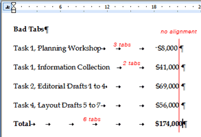
So in our example, a list with two columns (an item and its price), each line should have only one tab character between the item and the price. The reason not to have multiple tab characters in-between columns is the same reason that you don’t want extra spaces in-between words – it usually looks bad and can screw up formatting down the line.
Notice how the numbers above don’t quite align. Sort of like a tie with a bad knot that isn’t straight – it just doesn’t look right.
To add tabs in Word and PP:
- Make sure the ruler is visible (View > Ruler)
- Highlight the text you want to add a tab to
- Click the little tab button on the far left of the ruler to select the type of tab (left, center, right, or decimal)
- Click on the ruler where you want the tab to be
- To delete the tab, pull it down off the ruler

One other advantage of using tabs well: if you have to change the position of the column, you only need to change the position of a single tab (highlight all the lines, move the tab) instead of adding and deleting lots of individual spaces or tabs.
In my example above, I also added gray leader dots to guide the reader’s eye from the item to the price (an example of something you can’t do with tables).
Thursday, August 13, 2009
ecofont
Here’s an interesting twist on reducing your carbon footprint: ecofont.

A Dutch communications firm has designed a font with little holes in it to use less toner. Less toner means (in theory) your toner cartridge lasts longer and you can feel good about doing some little bit for the planet. I guess.
I’m not sure that poking holes in Verdana is necessarily great type design, but it does raise a valid point on printing and toner consumption. Bold colors and big photos look great onscreen but they do require a lot more toner to print, and that toner ultimately ends up somewhere. Even if you (or your customer, or your friends, or wherever your toner-based printed material ends up) recycle the paper, polymer-based toners are more difficult and usually require more energy to deink than their organic-based counterparts (i.e., ink).
Toner-based digital printing does offer advantages over traditional printing, but it’s also worthwhile considering the environmental impact of using so much toner.
Sunday, August 9, 2009
Good type matters (part 3): Spaces
The most important graphic element on any page (printed, web, or other) is type. It sends subtle but important signals to readers. Done well, it sends positive signals and reinforces your message; done poorly, it sends negative signals and confuses your message.
Businesses often use MS Word and Powerpoint to design countless communication pieces where type is often the only thing on the page (or screen). Applying some very basic typographic know-how can increase the legibility and effectiveness of those pieces. Today:
Spaces.
Horizontal space is just as important to legibility as vertical space. The biggest goofs I usually see about horizontal space involve spaces – too many of them.
Use one space after a period. Two spaces after a period is a holdover from the typewriter, but many are still taught to leave two spaces after a period. Good typography does not use two spaces after a period (or after any punctuation mark, for that matter). Searching for two spaces and replacing them with one is easily done in most software, but consistency is even more important. So, if you insist on using two spaces, then make sure all the periods are followed by two spaces (not one, or three, and five is right out).
Remove extra spaces. Extra spaces are another artifact of copying and pasting: they look bad, are distracting to readers, and can lead to some funky-looking paragraphs* (i.e., weird line breaks). Attention to detail will remove them. So can search-and-replace. To rid a document of all excess spaces in Word or PP (you may want to make a copy of the file in case you’re nervous):
- - -
* When I use the term paragraph, I mean it in a word-processing sense: any group of words before you hit the return key. For instance, each bullet list item above is a paragraph, or a floating label of six words in PP is also a paragraph.
Businesses often use MS Word and Powerpoint to design countless communication pieces where type is often the only thing on the page (or screen). Applying some very basic typographic know-how can increase the legibility and effectiveness of those pieces. Today:
Spaces.
Horizontal space is just as important to legibility as vertical space. The biggest goofs I usually see about horizontal space involve spaces – too many of them.
Use one space after a period. Two spaces after a period is a holdover from the typewriter, but many are still taught to leave two spaces after a period. Good typography does not use two spaces after a period (or after any punctuation mark, for that matter). Searching for two spaces and replacing them with one is easily done in most software, but consistency is even more important. So, if you insist on using two spaces, then make sure all the periods are followed by two spaces (not one, or three, and five is right out).
Remove extra spaces. Extra spaces are another artifact of copying and pasting: they look bad, are distracting to readers, and can lead to some funky-looking paragraphs* (i.e., weird line breaks). Attention to detail will remove them. So can search-and-replace. To rid a document of all excess spaces in Word or PP (you may want to make a copy of the file in case you’re nervous):
- Go to Edit > Replace
- In the Find What field, carefully type two spaces
- In the Replace With field, carefully type one space
- Bravely click Replace All (seriously)
- Repeat (you will need to repeat this process to clean out instances of three or more spaces in a row)
- - -
* When I use the term paragraph, I mean it in a word-processing sense: any group of words before you hit the return key. For instance, each bullet list item above is a paragraph, or a floating label of six words in PP is also a paragraph.
Wednesday, August 5, 2009
Post-toaster?
In The Designful Company, Marty Neumeier says “design is rapidly moving from ‘posters and toasters’ to include processes, systems, and organizations.” Amen.
I have always thought of design as a problem-solving process, and relate to other practitioners who also think visually (see blog roll to the right). Though I started as a graphic designer, I have found my own design skills adding value in many parts of business way beyond pictures.
I hope Marty doesn’t mind me referencing his phrase.
Tuesday, August 4, 2009
Seductive Technology
A few months ago Garr Reynolds asked for suggestions for his upcoming book on design – I sent him a version of this. Garr is a passionate advocate for good presentation design, writes a useful blog, and has authored a good book about the same ideas. There is a deep wisdom, insight, and self-knowledge at the core of his design principles, but I’m not sure all the important stuff always translates well for everyone.
I work in a global consulting firm of about 3,000 people and notice that only a small number of those professionals have the self-knowledge to go with less: less words, less talking, less on-screen, fewer pieces of paper, etc. As technical people, they have usually been taught to build methodical augments with lots of facts and conclusions at the end. This bias for facts (more facts = more proof), usually means more stuff to try to buttress the (not always well thought-out) argument.
While I could pick on my colleagues as engineers, they demonstrate habits that I see many people use when constructing presentations. There is a seductiveness to the technology that seems to overwhelm otherwise smart, thinking people. Three major areas in particular:
Really seeing things from the audience’s perspective. Part of this is what the Heath brothers call the Curse of Knowledge, but part of it is the classic design challenge: getting your clients (or yourself) to leave their (or your) assumptions aside. This effects everything about a designing a presentation, from where to begin to how much to cover and how. This also includes mundane things like actually testing slides and colors on the equipment and in the venue you will actually use (and planning to do that, and allowing time to change things if they look like mud).
Thinking about the presentation as an event. In my business, a “presentation” can mean everything from an intimate conversation with 4 or 5 people to a lecture in a room of 400. But what I notice (and relevant to design) is how people usually only focus on the Powerpoint file, not the overall event stream: the context of where those slides (or pieces of paper) will show up. Again, this raises all kinds of potential design issues, for example: what do you say, what do you project (onscreen), and what might you hand out (and how and when). Or how long do you really expect people to sit still – have you thought about biology and biorhythms (e.g., a warm dark room + 3 pm + 2-hour presentation = bad idea), what are you not going to cover, etc.
Limiting the bias toward cool. By “cool” I mean things that the author thinks are cool when they are creating them. Things like complex and gratuitous animation, a flow chart with impossible-to-read colors, way too many (bad) typefaces, a scan that nobody can read, a metaphoric image nobody understands, movies or sounds that don’t play, etc. My experience is that when many folks take on the role of presentation producer, they forget all the things they know as a presentation consumer or (worse) draw the wrong conclusions. For example, I work with a man who has a tremendous ability to read a room, and is naturally enthusiastic about his subject, but he also uses animation a great deal (maybe too much). I have seen people try to emulate him by copying the animation, not by paying attention to the audience or being excited about their topic. They can waste a great deal of time trying to create a clunky animation instead of really focusing on what the heck they’re going to say while the animation plays (or doesn’t, as the case may be). By worrying about the technology and other off-topic diversions, they and their presentations can become overly focused on widgets instead of the message.
Subscribe to:
Posts (Atom)
