Sunday, November 29, 2009

Thanksgiving surprise from the Heath brothers

It’s been a while, sorry for the absence. I got a great surprise in my inbox a few days ago from Chip and Dan Heath:
Hi Jeffrey, congrats, you are going to be receiving a free advance copy of our next book, Switch: How to Change Things When Change Is Hard. We “drew” your name randomly (and you were fighting the odds, by the way – fewer than 1 in 3 people who signed up will get the book, due to limited quantities).

Expect to see it in 2-3 weeks – and certainly before the Christmas holidays. Just wanted to let you know it’s on the way!

We hope you enjoy it, and thanks for staying interested in our work.

Happy Thanksgiving,
Chip & Dan
I’m not some totally wired netizen or important reviewer, just a designer working to improve the way people and companies present themselves, so this really did come as a surprise. And so when I do get it, and read it, I’ll be sure to blog on any thoughts or related ideas. In the meantime I’d just like to say thanks to Chip and Dan.

On the experience. I’m not naive. I assume Chip and Dan didn’t personally select every name, and it may be that I was just on the right side of the 1 in 3 odds, but the experience still matters to me. And isn’t that the point? Think about that the next time you are taking your latest idea (or presentation) to someone – what will the experience feel like to them?
  • Will it seem like you listened to their concerns, their needs, their POV, and responded with something that acknowledged and spoke directly to those issues?
  • Or will it seem like you took your methodology, your approach, your terminology and added their logo?
Little things go a long way in effecting experience. The Heath brothers could have sent out a less personal email, it could have come from the publisher instead of them, they could have just sent the book with no email – but then my experience would have been different.

Friday, October 30, 2009

More legibility = less boldface

If you have single slides with lots of words on them (such as a paragraph), don’t use bold type. Or all capital letters. Or worse, combine them (bold all capitals). It makes your text very difficult to read.

Here’s why:

Roman (or normal or regular) type is designed to be read and is at the core of all text faces.* Bold type usually has less white space, both inside the letters and between letters, and so the letters visually blend together more than their roman counterparts. The result is big white or black perceptual masses with less distinct letter shapes, and so your readers need to slow down to recognize letters and words. And if your audience is spending more mental energy processing text shapes, that’s less mental energy available to pay attention to you and your message.

Traditional typography sets most text in roman type with italics and bold reserved for specific uses or headlines. (And bold italic faces were rarely seen before the 1980’s). These conventions exist because they work. Roman type is easier to read, especially in larger blocks of text. Even projected, medium weight letters read better than all bold ones.

Here’s another, more practical reason not to make your slides all bold, all the time (or all-cap, all bold, all the time – shudder). If you start with bold all-caps, how do you emphasize something? Make it bigger, brighter, even harder to read? There’s nothing left.

So, if you have slides with bunches of words that looks similar to paragraphs, then this applies to you:
  • If you are designing slides in PP to project to a large group, it would be best to remove most of the words from your slides. Then you can feel free to use bold for the remaining 4 words on the slide.
  • If you are designing a slideument (a document that will be printed and may be projected), please “unbold” all that bold type (you’ll use less toner when you print, too).
Your audience will thank you.

* Display faces – those that are not designed to be used for entire paragraphs of text – usually don’t have many variations, if any.

Tuesday, October 20, 2009

“Filling space”

I encounter many aspiring designers in my work. It seems that some of them aspire to fill troubling white space with stuff. Extra text, cheesy clip art, blurry photos. You get the idea. Here is a tip on how to use photography in PP files to “fill space.”

Don’t.

Ok, I know many of you just can’t do that. The draw is just too great. Like some universal force, you - must - fill - the - space. So give in to the dark side, but do it with style. Choose a single image, not many. And make sure it’s a good one. Here are some tips:

If you are discussing many ideas, you don’t need to have an image to represent each one. Really. Especially on the same page. A single image can be remarkably effective, and is usually better looking than a whole bunch of little images. It’s also more efficient. You can spend less time looking for one really great image instead of more time gathering a bunch of mediocre ones.

Look for imagery in unusual places. If you have a digital camera, you may already have some good images lurking around. And you can always take some more. Get really close to things or frame usual objects in unusual ways. Clouds, landscapes, ordinary objects around the house are all potentially great images.

Crop. Do what professionals do, crop an image so that it becomes more interesting. For example, a typical snapshot often has the subject perfectly centered in the middle of the frame with lots of space all around. Boring. If you crop the image so that the subject is off-center (Google rule of thirds) and that some of the subject is cut off by the frame, the same image can become more dynamic.

You don’t have to be literal. If your topic or business is not particularly photogenic or doesn’t lend itself to naturally stunning images, then go for beauty over fact. Many of us work in businesses that are either visually boring (or downright ugly) or so intangible that visualizing key ideas is fraught with the peril of cliché. Resist. In the context of filling space, beautiful images can stand on their own with no hidden meaning.

Avoid clichés. Think beyond what first comes to mind. For example, a crystal-clear picture of a diverse group of people sitting around a conference table with their sleeves rolled-up is a crummy expression of teamwork. What about a motion-blurred photo of an 8-person rowing crew?

Repeat. There is no law that says you can’t reuse the same image over and over again. In the context of filler images, combined with interesting cropping, a single image can easily be used throughout a presentation. As noted earlier, this also has the advantage of being more efficient.

Again, if you are filling space, consider why the space is there in the first place. Some professional designer probably intended for the space to be clean. But if you must alter the design, try to do it well.

Tuesday, October 13, 2009

Need to write

Sorry.

Time keeps passing, I need to write.

Funny thing about blogs: writing them is (or can be) very fulfilling, and help articulate otherwise mushy ideas. But for me, unless an idea really reaches out and grabs me – just won’t let me stop thinking about it – it usually ends up in a growing Word file called “blog topics.”

Oh well.

More in the next day or two.

Wednesday, September 30, 2009

Son of presentation landscape

In July, Nancy Duarte created a great visualization she titled Presentation Landscape. I really like her diagram, but as I showed to a few people there were questions about the X axis, particularly the slideument-preso continuum.

I thought about my own experience helping non-designers deal with the world of documents, slideuments, and presentations. The way that good visuals often start life as sketches on napkins or whiteboards, and the way those ideas often need to flow back and forth between different forms over the life of a project. (And the way that once something gets into Powerpoint, it often seems to get trapped there.)

Son-of Landscape PresentationWhen you think about the journey of an idea and how projects often evolve, it seems like it’s difficult to resist using existing slides that may have been fine for a working thinkpiece, but are really not up for the important presentation or executive briefing. And sometimes PP is not the right tool for making documents. And sometimes (gasp) no documents or paper are necessary at all (yikes, what am I saying?). Picking up on Nancy’s original point, the same slide or deck may not be worth fighting for one day, but may be ill-suited for a higher stakes presentation later in the project.

Anyway, this little diagram is trying to visualize what I was thinking, maybe build on Nancy’s brilliant original. I hope she’s not offended.

(Geek alert: you can hide the path layer to just see where different forms map.)

Sunday, September 27, 2009

One Little Thing

A little story about how one little thing makes a difference.

I am not a big TV tech guy. We watch TV, but are hopelessly non-digital, non-HD, non-Blu-Ray, etc. A month or two ago, our cable provider (a very large profitable company based nearby) sent us a nice note that said “if you’d like to keep watching your extended cable channels, you’ll need to get these little digital converter boxes for free, you luddites.” (Ok, they didn’t call us luddites.)

So I go online and get the boxes sent to us for self-installation. I’m fairly tech-savvy and figure that this will be pretty simple. The boxes came with good, clear instructions and setting them up was fairly straight-forward. So far so good.

I go online to activate the devices, and one out of three get turned on immediately. Still, no big deal, so I call the activation number and wait on hold for about 15 minutes. I’m ok with this – they let me know that their call volume is high, give me other options, so I’m patient and I wait. While I wait I look through their online FAQs and troubleshooting guide, but nothing about the situation at hand. I speak to a very friendly and helpful person who, after the requisite “is it turned on?” questions, activates both other boxes.

I think.

One of these boxes is larger and all the instructions clearly say “set your TV to channel 3” and “leave it be for 45 minutes while it loads your channels” and “it will turn itself off when it’s done.” So I eat, do some chores, come back. The box is still on, the TV is still nothing but static. I go online to see if this is normal. Back through the all FAQs etc., and find one that says: “if nothing happens after 45 minutes, try again.” So I do. And wait another hour. Still nothing but static. I call the support number again. This time I’m on hold for 30 minutes, maybe longer. When I finally get to a human being (also very nice), after I explain the situation (reset it 2 or 3 times, still no picture), the first thing she asks me is “is your TV on channel 3 or 4?” I switch to channel 4 and – wait for it – everything is working just fine. For all I know it was working just fine the first time, but in all my hunting I hadn’t seen one FAQ, instruction, troubleshooting answer, knowledgebase entry, or the like that said “try channel 4.”

I wondered if there had been something and I just overlooked it, so I went back to the site and hunted. Nope. I wondered if there was a hardware switch that I had overlooked. Nope. I looked back through all the simple instructions. Nothing there either.

This was not a huge big deal, just a minor annoyance. But my otherwise good experience (from getting the notice to ordering to setting up the hardware) was dramatically affected by one little thing (try channel 4). All the stuff I encountered was very helpful and explained very clearly what should happen and how do deal with certain known issues, but trying channel 4 wasn’t one of them.

If the company had included some additional tips online (the sort of thing I imagine is available to their call center staff), I could have been trying that at noon instead of 4:30, and my total experience would have been different.

One little thing.

Sunday, September 20, 2009

The value of making real things

My father was a well-respected civil engineer. A colleague of his told me he was an “engineer’s engineer, the go-to guy when you had any question.” But he was also a craftsman who took pride in doing things well and paid attention small details. His father (my grandfather) was the same way: he did so many things with the intentional precision of a of a fine cabinetmaker.

I’ve been thinking about this recently as I try to discover meaning in the second half of my own life, and trying to better articulate the organizational value of craftsmanship and good work when good enough seems to be the measure for many in business.

Soft issues like feelings, intuition, aesthetics, style, or behavior really matter to an organization’s health in ways that are difficult to measure. It’s not that smart people don’t understand this (intellectually), it’s that they can’t act on it (emotionally). And I think there’s a connection between that emotional engagement (or lack of it) and craftsmanship.

Fewer and fewer people today actually make stuff – real tangible things, not abstract ideas like wealth or solutions – and so fewer and fewer people have the opportunity to develop an appreciation for the meticulousness that is required to excel at a craft and do really good work.

When you enter a craft, you quickly realize that it takes both patience (time) and persistence (effort) to master it. The idea of building fine furniture or cooking a world-class meal is straight-forward, but actually doing it exposes you to feelings and emotions that don’t ever appear in the measured drawings or recipe. And the only way to get good at it is to keep trying. And trying. And trying (that is, just because you’ve tried something 50 times doesn’t mean the result is going to be wonderful).

In many business activities, good enough seems to be sufficient – the presentation, brochure, report, website, product, event is good enough. Good enough to make it to the next stage, meet the immediate expectation, satisfy the boss, check it off the list. Which is fine – but that doesn’t mean it’s good (or great). Think Oldsmobile.

Don’t get me wrong, there are times when good enough is just fine. When the stakes are low it would be silly to use limited resources to produce world-class stuff. The slide show on the company picnic probably doesn’t need the $300/hour agency treatment. Of course the challenge is if one can’t really distinguish between good enough and good (or excellent), then how can one know when good enough isn’t?

My theory is that those with little experience in making real things also lack certain emotional experiences that help them understand and act on the softer ideas that help give an organization meaning and soul.

Well, that’s my theory (or maybe half-theory). I’m still working on it.

Monday, September 14, 2009

Steve Jobs on design

Came across this last week from a 1996 interview by Gary Wolf in Wired magazine (more than 15 years ago). A classic.

- - -

You have a reputation for making well-designed products. Why aren’t more products made with the aesthetics of great design?

Design is a funny word. Some people think design means how it looks. But of course, if you dig deeper, it’s really how it works. The design of the Mac wasn’t what it looked like, although that was part of it. Primarily, it was how it worked. To design something really well, you have to get it. You have to really grok what it’s all about. It takes a passionate commitment to really thoroughly understand something, chew it up, not just quickly swallow it. Most people don’t take the time to do that.

Creativity is just connecting things. When you ask creative people how they did something, they feel a little guilty because they didn’t really do it, they just saw something. It seemed obvious to them after a while. That’s because they were able to connect experiences they’ve had and synthesize new things. And the reason they were able to do that was that they’ve had more experiences or they have thought more about their experiences than other people.

Unfortunately, that’s too rare a commodity. A lot of people in our industry haven’t had very diverse experiences. So they don’t have enough dots to connect, and they end up with very linear solutions without a broad perspective on the problem. The broader one’s understanding of the human experience, the better design we will have.

Is there anything well designed today that inspires you?

Design is not limited to fancy new gadgets. Our family just bought a new washing machine and dryer. We didn’t have a very good one so we spent a little time looking at them. It turns out that the Americans make washers and dryers all wrong. The Europeans make them much better – but they take twice as long to do clothes! It turns out that they wash them with about a quarter as much water and your clothes end up with a lot less detergent on them. Most important, they don’t trash your clothes. They use a lot less soap, a lot less water, but they come out much cleaner, much softer, and they last a lot longer.

We spent some time in our family talking about what’s the trade-off we want to make. We ended up talking a lot about design, but also about the values of our family. Did we care most about getting our wash done in an hour versus an hour and a half? Or did we care most about our clothes feeling really soft and lasting longer? Did we care about using a quarter of the water? We spent about two weeks talking about this every night at the dinner table. We’d get around to that old washer-dryer discussion. And the talk was about design.

We ended up opting for these Miele appliances, made in Germany. They’re too expensive, but that’s just because nobody buys them in this country. They are really wonderfully made and one of the few products we’ve bought over the last few years that we’re all really happy about. These guys really thought the process through. They did such a great job designing these washers and dryers. I got more thrill out of them than I have out of any piece of high tech in years.

Monday, September 7, 2009

Edit > Paste Special

I think this is one of the true secrets of good communication online – give people something usable (and don’t create huge files/emails in the process). The good news and bad news about copying and pasting in Windows is the same: it’s easy. Unfortunately this seemingly simple act causes untold problems down the digital line. I address a few here (and how to avoid them):

Copying text or a table from Excel. If you are pasting into Word, no problem, but if you’re pasting rows and columns of text into any none-Microsoft product, you probably will end up pasting a picture of text, not real text. The solution: use Edit > Paste Special > Paste as Text (or sometimes Paste as HTML). Why does this matter: because someone else might like to actually copy and use that text, and cannot if you only send them pictures of letters.

Copying a graph from Excel. Even with other MS apps, Excel doesn’t always play well with others. Ever wonder why that PowerPoint file is 18 MBs? It might be all those charts you copied and pasted from Excel. The problem is that Excel not only copies the chart, but also the entire rest of the file (every tab, every worksheet). In addition to making your PP file huge, it can also reveal information you might not want other people to see. The solution: Use Edit > Paste Special > Paste as Picture. This ensures that only the chart comes in, not all the other stuff in the file.

Sometimes it helps to have an intermediary app to paste stuff into before going to the final destination. For example, a screen shot (Alt-Prnt Scrn) is often a 24-bit image (there’s a lot of information for each pixel), which equals a large file, especially if you have a bunch in a single Word file. The solution: Copy the screen dump into Paint first (Start > Programs > Accessories > Paint), unselect it, then recopy into your Word doc. The resulting copy will have less bit-depth, and result in a smaller Word file.

Sunday, September 6, 2009

Japanese Industrial Design

Reading about the new Mac OS – how it’s a lot of under-the-hood improvements but not many sexy new features – I got thinking about this from Wired, September 2001:
“In Japanese design, every little part, every little line, every little button is well thought-out. It’s as if each element is saying, ‘I am a part of this machine and I have to do my job, too, no matter how small.’ Next year’s model may not seem new, but it’s improved. And it’s not just consumer electronics. Look at a company like Honda. They’ll make a convertible sports coupe that could eat a Porsche Boxster alive on the racetrack, but it will look like a slightly pointy Civic. As a culture they’re not necessarily choosing to innovate: They choose to perfect.”

Gray Holland is part of the brain trust at frog design, the firm responsible for everything from Apple’s early look and feel to the new Ford Th!nk, an all-electric concept vehicle.
Eight years later it still seems to be true.

Thursday, September 3, 2009

Good type matters (part 6): dashes

Type is the single most important graphic element on most pages (or slides, or webpages, or emails).

Use En-dashes.

Admittedly this is bordering on the typographically compulsive, but I do feel it’s important to know the difference. In ordinary use, there are three kinds of dashes:
  • Hyphen. Technically a punctuation mark, it is the shortest of the three and the thing on your Qwerty keyboard next to the zero. ( - ) It is used for hyphenated words (duh) an to break words over multiple lines (a task often done by your computer, but the best results require some human intervention).
  • En-dash. A little longer than the hyphen (an en-space, to be exact), it is used in modern typography to set off phrases – use it with a normal word space on either side.
  • Em-dash. The so-called long dash—it is rarely used in modern typography. You may still see it used, but to quote Robert Bringhurst: “The em-dash is the nineteenth-century standard, still prescribed in many editorial style books, but the em-dash is too long for the best text faces. Like the oversized space between sentences, it belongs to the padded and corseted aesthetic of Victorian typography.”
Please note there is no double hyphen. The double hyphen was the typist’s indication when preparing manuscripts that a dash (probably an em-dash) should be set. Your typography will be more elegant if you unlearn this habit (or even easier, set Word and Powerpoint to replace “--” with “–” by going to Tools > Autocorrect > AutoFormat as You Type and select Symbol Characters with Symbols).

But as with quotation marks, consistency is more important than typographic rules. So if you are going to use double hyphens (or are assembling bits from people that do), then do so consistently. There are also times when a client or customer’s own style may call for using em-dashes instead of spaced en-dashes, so (obviously) one would follow the their style in such cases.

- - -

This is the last of these for now (I originally started with only three items). Typography is an art that some people study for a lifetime, and these suggestions are ridiculously simplified guidance for one minor aspect of it. Still, if the reader is interested in getting their audience to actually read what they write, these issues are a place to start. For those that want to know more, the de facto reference has become Robert Bringhurst’s The Elements of Typographic Style.

Monday, August 31, 2009

Design is contextual

Duh.

That design is contextual, or rather, good design is contextual is a bit of a duh. But still worth reminding ourselves from time to time.

I was reminded reading Garr Reynold’s recent posterous on Japanese elections. What I noticed first was how colorful the screen shots of election results from Japanese TV are and I have to admit my first thought was “wow, you’d never see that on CNN.” But that’s the point. As Garr noted, Japanese TV likes lots of color, it’s part of their visual grammar. So in context, it may be good design (the first chart is clear and makes its point) even though it probably wouldn’t ever appear on any US cable news.

But you don’t have to go overseas to find different contexts that call for different design. For example, creating a great presentation that works well in ballroom speech to 300 like-minded technical colleagues probably won’t translate in explaining (aka selling) the same idea to a small group of non-technical potential customers (buyers).

Friday, August 28, 2009

Truth in labeling

I can’t remember where, but I once heard someone say that there were only two professions that called their customers “users.” It was not a compliment.

I am always sensitive about describing users in the abstract, as if they were one big class. Your website has visitors, some of them may be customers or clients, some may even be friends. Your application or tool is used (hopefully) by managers, or accounts, or marketers. A form or survey is filled in by your guests or employees. You get the idea.

For almost any given tool, process, communication, etc., the mass of different users have different experiences and expectations, so why lump them together using one ill-fitting term?

Having been on the application-design side, I know it’s tempting to describe people by the role they play in a flow chart or white board (the user does X, then Y happens) – I’ve done it myself – but that doesn’t mean it’s a good practice. The more abstract those people (users) become to the people designing tools (designers), the less likely it is that those tools will meet the expectations or needs of the intended audience.

I know, it’s only a word. But like so many words, the language we choose can:
  • help clarify our thinking and help us make better decisions; or
  • get in the way of exchanging ideas and confuse our decision-making.
And today, a lot more people design tools. If you’ve made a Powerpoint file that someone else is supposed to use, you’re a developer.

Thursday, August 27, 2009

Not getting the whole “user in control” thing

I just had an interesting loop experience on a popular site.
  1. The banner ad automatically popped up covering some of the content. Ok, this is annoying and obviously not respecting the site visitor, but it happens and I expect it will either a) close itself in a few seconds, or b) close when I find and click the Close link.
  2. I find the Close link and click it.
  3. The ad closes. But wait – it pops up again. What?
  4. So I repeat step 2. And it happens again: it seems to close and then open right back. What is going on?
As it turns out, a clever combination of marketers and programmers have put a rollover action in the same spot as the Close link, so unless I move the mouse really quickly, the rollover action triggers the pop-up again. Clever eh?

But what is the real effect? I spent 10 seconds interacting with a company I didn’t want to pay attention to in the first place. Do you suppose I’m inclined to think better of them now that I have had to defeat their ad in order to read what I originally wanted?

Me either.

To be fair, maybe this was unintentional. Maybe this little endless loop was an accident. But wouldn’t that be even worse? That would imply the advertiser didn’t test their banner ad. Hmm, old advertising habits die hard. Good design puts users in control.

Tuesday, August 25, 2009

My dad, health insurance, and napkin drawings

My dad died one year ago today. I miss him terribly, and that plus a recent work by Dan Roam (or this video version for those with shorter attention spans) got me thinking about health insurance.

About 11 days before he died, my father fell and had to be taken to the hospital where he stayed for a little less than 4 days. It cost about $60,000. He didn’t get heroic measures or strange procedures that I’m aware of (that wasn’t his style), he was just weak and his lungs were failing because of emphysema. So they did some tests and patched him up and sent him home. He lived at home with hospice for a week (all paid for by insurance), and after a very long weekend, he died peacefully while being taken care of by a hospice volunteer* with my mother and I by his side.

The point of this little story is that my father had pretty good health insurance. A combination of Medicare and supplemental insurance meant that my parents didn’t go broke as father’s illness progressed. But they still paid a boatload of money. One year they paid close to $16,000 after Medicare and insurance ran out. When he died, they were paying about $3,000 per year on just his prescriptions (again, after Medicare and insurance maxed out). Thankfully, they could.

The point. The phrase of the moment is “healthcare” but (as Dan points out) it should be health insurance reform, because that’s what it’s really about. As far as I know, no one is talking about nationalizing hospitals or other aspects of healthcare providers – all the noise is about health insurance. Why don’t we just start calling it that?

BTW, I’m not busting on health insurance companies per se, I’m not sure it’s completely fair to to dump everything on businesses that are competing in a market. To me, the national debate should be about how we want to pay for this stuff? Should healthcare be like other businesses? Is the invisible hand of the market is a good model for managing national healthcare? Again, I think Dan does a great job simplifying this question.

Sorry for the long philosophical tangent, back to communication tomorrow (or the next day).

- - -

* Hospice volunteers are amazing people, and I can’t praise them enough. They routinely enter very sad situations and provide necessary services with grace and dignity. I learned a hell of a lot from my dad’s last volunteer Linda. Wherever you are, thank you.

Intentional smudge

I used to know an illustrator who described how he would add a smudge to some inconsequential area of an illustration because he knew art directors (his clients) would always want to change something, so he gave them a target. I called this the intentional smudge and have discussed it with clients and used it myself from time to time.

I was amused to see Seth’s latest post discuss the same basic principle.

Both are good ways to help keep important ideas intact through the rigors of most approval processes. Of course, that assumes the stuff is worth keeping.

Saturday, August 22, 2009

Good type matters (part 5): quotation marks

Type is the most important blah blah blah ... (see my earlier posts).

Quotation marks.

This is both easy and complicated: use real quotation marks and apostrophes. This matters everywhere, but it really stands out in headlines and other large type. Quotation marks (both single and double) are a matched set, that is they have a front and back (or beginning and end). The things on your keyboard are prime and double prime marks, and they do not come as a set. There are regional variations on use (including using guillemets instead of quotation marks), and positioning differences (for instance, German traditionally uses opening quotes below the baseline instead of at the ascender), but all use different symbols to open and close a quotation.

“thus” (quotation marks, sometimes called curly quotes), not "this" (double prime marks, sometimes called straight quotes)

Ditto for apostrophes.

Adjust your software to use real quotation marks. And please don’t use too many of them (quotation marks “seem” to be “overused” so often there is a great “website” dedicated to their “overuse”).

The easy part is setting Word or PP to use so-called curly quotes. In both programs, Microsoft has cleverly hidden the control under Tools > AutoCorrect > AutoFormat As You Type: check the Straight Quotes with Smart Quotes box.

The complicated part is that many other pieces of software you encounter don’t have such nice features, and so when you type the " or ' characters, that’s what you get. Oh well, c’est la vie. If you’re compulsive, like me, there are ways around this (copying and pasting, using strange key combinations, etc.), but for most people this is probably too much to worry about.

Prime and double prime marks are used as abbreviations for feet and inches (I’m 5'11"), and for minutes and seconds of an arc (60" = 1°). They are also used in math and science. In any of these uses, quotation marks would be incorrect and silly-looking.

Friday, August 21, 2009

Weird Design: Hotels on Weather Sites

I like Weather.com. It always loads quickly, and I like that with two clicks I can get to a radar map of my area. This can be really useful information for planning things like: should I leave now or wait until a really bad storm passes? Should I mow the lawn or can I wait until later? Etc.

But I cannot figure out why, on Weather.com’s interactive radar map, Hampton Inn sponsors a little location finder (a little button you can click to show where the Hampton Inns are in the area). Think about it: why would someone come to this place on Weather.com? If I’m looking for local radar weather, on the web, what possible reason would I have for knowing where there are Hampton Inns? To get out of the rain? To seek shelter from a tornado? What? I just don’t get it.

Now, I’m all for advertising and sponsorship – it’s why Weather.com can provide cool tools like this – I just can’t figure out why someone at Hampton Inn thought “now this would be a good placement opportunity.” It just strikes me as weird, by which I mean: not necessarily well-designed.

(Of course, it did get me talking about Hampton Inn, didn’t it? Maybe not so weird. Nah, still weird.)

Thursday, August 20, 2009

LO Presentations

I just sat through another LO presentation (Lost Opportunity). It could have been interesting, even emotional and moving. Alas, it was ordinary and message-less.

It’s not that there wasn’t information in it (there was plenty), it’s that it lacked a core message – nothing that we (the audience) needed to know, believe, or question. I still don’t know what the problem was, why I should care about it, and what, if anything, I’m supposed to do about it. A lost opportunity.

It is frustrating to participate (or at least be the passive audience) in these events, and it is reasonably easy to avoid with a smidge of planning.

For most sorts of communications, before you open any software, get a single piece of paper and writing device (seriously, don’t open Word):
  • Who is the audience(s) for this?
  • What is the problem or issue?
  • Why is it important (to that audience)?
  • How does it impact them? (If it doesn't impact them, why should they care?)
  • What (if anything) can they do about it? (If they can’t really do anything, why should they care?)
Answer each of these with one sentence or less. Save that piece of paper and put it next to your computer when you start developing the presentation. (More on using paper to develop good presentations later. Hint: don’t start in PP.)

Wednesday, August 19, 2009

Good type matters (part 4): using tabs

Type is the most important graphic element on any page (printed, web, or other). It sends subtle but important signals to readers. Done well, it sends positive signals and reinforces your message; done poorly, it sends negative signals and confuses your message.

Tabs

Ok, tabs are really a layout issue, but you only encounter them using type, and using them poorly can waste huge amounts of time and create bad-looking pages. As a reminder, tabs are those things that you can use within bodies of text to align type (say, in columns). In some ways, tabs have been superseded by tables (tables can do the same alignment tricks and more), but there are lots of places where tabs still appear and make sense to use instead of a table. So here is the big point:

Set specific tabs to suit your specific needs
(or: don’t use the default tabs).

In Word and PP, you can set tabs based on your needs. For instance, if you have a list of items with prices for each, you could set a single decimal-aligned tab to align the column of numbers. What you should not do is keep hitting the tab key and adding spaces until things kinda-sorta line up.


So in our example, a list with two columns (an item and its price), each line should have only one tab character between the item and the price. The reason not to have multiple tab characters in-between columns is the same reason that you don’t want extra spaces in-between words – it usually looks bad and can screw up formatting down the line.

Notice how the numbers above don’t quite align. Sort of like a tie with a bad knot that isn’t straight – it just doesn’t look right.

To add tabs in Word and PP:

  • Make sure the ruler is visible (View > Ruler)
  • Highlight the text you want to add a tab to
  • Click the little tab button on the far left of the ruler to select the type of tab (left, center, right, or decimal)
  • Click on the ruler where you want the tab to be
  • To delete the tab, pull it down off the ruler


One other advantage of using tabs well: if you have to change the position of the column, you only need to change the position of a single tab (highlight all the lines, move the tab) instead of adding and deleting lots of individual spaces or tabs.

In my example above, I also added gray leader dots to guide the reader’s eye from the item to the price (an example of something you can’t do with tables).

Thursday, August 13, 2009

ecofont

Here’s an interesting twist on reducing your carbon footprint: ecofont.


A Dutch communications firm has designed a font with little holes in it to use less toner. Less toner means (in theory) your toner cartridge lasts longer and you can feel good about doing some little bit for the planet. I guess.

I’m not sure that poking holes in Verdana is necessarily great type design, but it does raise a valid point on printing and toner consumption. Bold colors and big photos look great onscreen but they do require a lot more toner to print, and that toner ultimately ends up somewhere. Even if you (or your customer, or your friends, or wherever your toner-based printed material ends up) recycle the paper, polymer-based toners are more difficult and usually require more energy to deink than their organic-based counterparts (i.e., ink).

Toner-based digital printing does offer advantages over traditional printing, but it’s also worthwhile considering the environmental impact of using so much toner.

Sunday, August 9, 2009

Good type matters (part 3): Spaces

The most important graphic element on any page (printed, web, or other) is type. It sends subtle but important signals to readers. Done well, it sends positive signals and reinforces your message; done poorly, it sends negative signals and confuses your message.

Businesses often use MS Word and Powerpoint to design countless communication pieces where type is often the only thing on the page (or screen). Applying some very basic typographic know-how can increase the legibility and effectiveness of those pieces. Today:

Spaces.

Horizontal space is just as important to legibility as vertical space. The biggest goofs I usually see about horizontal space involve spaces – too many of them.

Use one space after a period. Two spaces after a period is a holdover from the typewriter, but many are still taught to leave two spaces after a period. Good typography does not use two spaces after a period (or after any punctuation mark, for that matter). Searching for two spaces and replacing them with one is easily done in most software, but consistency is even more important. So, if you insist on using two spaces, then make sure all the periods are followed by two spaces (not one, or three, and five is right out).

Remove extra spaces. Extra spaces are another artifact of copying and pasting: they look bad, are distracting to readers, and can lead to some funky-looking paragraphs* (i.e., weird line breaks). Attention to detail will remove them. So can search-and-replace. To rid a document of all excess spaces in Word or PP (you may want to make a copy of the file in case you’re nervous):
  • Go to Edit > Replace
  • In the Find What field, carefully type two spaces
  • In the Replace With field, carefully type one space
  • Bravely click Replace All (seriously)
  • Repeat (you will need to repeat this process to clean out instances of three or more spaces in a row)
I know what you’re thinking – what about that place where I added 30 spaces to get things to line up or appear centered on the page? We’ll deal with that in the next episode: tabs.

- - -

* When I use the term paragraph, I mean it in a word-processing sense: any group of words before you hit the return key. For instance, each bullet list item above is a paragraph, or a floating label of six words in PP is also a paragraph.

Wednesday, August 5, 2009

Post-toaster?

In The Designful Company, Marty Neumeier says “design is rapidly moving from ‘posters and toasters’ to include processes, systems, and organizations.” Amen.

I have always thought of design as a problem-solving process, and relate to other practitioners who also think visually (see blog roll to the right). Though I started as a graphic designer, I have found my own design skills adding value in many parts of business way beyond pictures.

I hope Marty doesn’t mind me referencing his phrase.

Tuesday, August 4, 2009

Seductive Technology

A few months ago Garr Reynolds asked for suggestions for his upcoming book on design – I sent him a version of this. Garr is a passionate advocate for good presentation design, writes a useful blog, and has authored a good book about the same ideas. There is a deep wisdom, insight, and self-knowledge at the core of his design principles, but I’m not sure all the important stuff always translates well for everyone.

I work in a global consulting firm of about 3,000 people and notice that only a small number of those professionals have the self-knowledge to go with less: less words, less talking, less on-screen, fewer pieces of paper, etc. As technical people, they have usually been taught to build methodical augments with lots of facts and conclusions at the end. This bias for facts (more facts = more proof), usually means more stuff to try to buttress the (not always well thought-out) argument.

While I could pick on my colleagues as engineers, they demonstrate habits that I see many people use when constructing presentations. There is a seductiveness to the technology that seems to overwhelm otherwise smart, thinking people. Three major areas in particular:

Really seeing things from the audience’s perspective. Part of this is what the Heath brothers call the Curse of Knowledge, but part of it is the classic design challenge: getting your clients (or yourself) to leave their (or your) assumptions aside. This effects everything about a designing a presentation, from where to begin to how much to cover and how. This also includes mundane things like actually testing slides and colors on the equipment and in the venue you will actually use (and planning to do that, and allowing time to change things if they look like mud).

Thinking about the presentation as an event. In my business, a “presentation” can mean everything from an intimate conversation with 4 or 5 people to a lecture in a room of 400. But what I notice (and relevant to design) is how people usually only focus on the Powerpoint file, not the overall event stream: the context of where those slides (or pieces of paper) will show up. Again, this raises all kinds of potential design issues, for example: what do you say, what do you project (onscreen), and what might you hand out (and how and when). Or how long do you really expect people to sit still – have you thought about biology and biorhythms (e.g., a warm dark room + 3 pm + 2-hour presentation = bad idea), what are you not going to cover, etc.

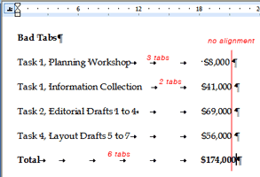
Limiting the bias toward cool. By “cool” I mean things that the author thinks are cool when they are creating them. Things like complex and gratuitous animation, a flow chart with impossible-to-read colors, way too many (bad) typefaces, a scan that nobody can read, a metaphoric image nobody understands, movies or sounds that don’t play, etc. My experience is that when many folks take on the role of presentation producer, they forget all the things they know as a presentation consumer or (worse) draw the wrong conclusions. For example, I work with a man who has a tremendous ability to read a room, and is naturally enthusiastic about his subject, but he also uses animation a great deal (maybe too much). I have seen people try to emulate him by copying the animation, not by paying attention to the audience or being excited about their topic. They can waste a great deal of time trying to create a clunky animation instead of really focusing on what the heck they’re going to say while the animation plays (or doesn’t, as the case may be). By worrying about the technology and other off-topic diversions, they and their presentations can become overly focused on widgets instead of the message.

Friday, July 31, 2009

Good Type Matters, Part 2: Leading

The most important graphic element on any page (printed, web, or other) is type. It sends subtle but important signals to readers.
  • Done well, it sends positive signals and reinforces your message.
  • Done poorly, it sends negative signals and confuses your message.
Businesses often use MS Word and Powerpoint to design countless communication pieces where type is often the only thing on the page (or screen). Applying some very basic typographic know-how can increase the legibility and effectiveness of those pieces.

In this post:

Line spacing (leading).

Leading is the space in between lines (so called because in the very old days, typographers would need to add thin strips of lead in between lines of type).

Here is the basic rule for most non-designers in ordinary business:

Err on the side of greater line spacing.

Bad line spacing is a giveaway that no one has paid attention to legibility, and it usually makes your type more difficult for people to read. So why would anyone do it?

The correct leading gives readers little channels for their eye to follow to the next line – the closer lines are together, the harder it is to get to the next line (and so legibility decreases). Typical leading is at least 120% of the type size for a normal width paragraph (such as that set in a newspaper or book), so 10-point type might have 12-point leading* (spacing). But, as lines get longer (the width of the paragraph), the space in-between needs to increase to give readers a clear route back across the page (or screen), so the same 10-point type might need 14- or even 20-point leading to make sure the paragraph is comfortable for the reader. Negative leading (i.e., 10-point type with 8-point leading) is never a good idea for regular text. Never, never, never. So, if your paragraph (or even as few as two lines) look squished, you are slowing your readers down and making them work harder. Don’t do it.

If adding more space makes the report or presentation longer and you want to limit the length or amount of pages, editing is the answer, not making more type more difficult to read.

- - - -

* Technically, this would be 2 points of leading (10-point type + 2-points leading = 12-point spacing from line to line). I use the term spacing hear because office applications refer to inter-line spacing that way, not as leading.

Sunday, July 26, 2009

Good Type Matters, Part 1

(First in a series.)

The most important graphic element on any page (printed, web, or other) is type. It sends subtle but important signals to readers.
  • Done well, it sends positive signals and reinforces your message.
  • Done poorly, it sends negative signals and confuses your message.
Businesses often use MS Word and Powerpoint to design countless communication pieces where type is often the only thing on the page (or screen). Applying some very basic typographic know-how can increase the legibility and effectiveness of those pieces. Today’s topic:

Use the same font.

I know it sounds obvious, but when you copy-and-paste from lots of different sources, it’s easy to end up with three or four similar typefaces in the same letter, or slide, or paragraph, or sentence (I’ve seen each). Though subtle, people pick up on this and it leaves an unflattering impression. It’s sort of like mismatched socks or wearing two different browns that just don’t go together – people notice, even if they can’t readily identify it. For example, Palatino (aka Book Antiqua) and Times New Roman look similar, but not alike:

Hamburgerfons Hamburgerfons

Add a line of Helvetica (or worse, Arial) and a callout in Verdana, and you have the makings of a really moshed-together slide (or letter, or report, or email).

Hamburgerfons Hamburgerfons

Does it change what you are saying? Well, yes it does. In the same way that an ill-fitting suit or bad manners detracts from your message, bad typography like this says “I really don’t care about the details”, or worse, “I didn’t notice them.” Is that what you want to say to current and future clients? (I didn’t think so.)

One way to avoid this is to always use Paste > Special > Plain Text, but that’s not practical, so you’ll just need to remember to pay extra attention to fonts as you copy-and-paste (and reapply the style or font to the text in question to be sure).

Next time: line spacing (leading).

Monday, July 20, 2009

Forty Years Later

Today is the 40th anniversary of mankind’s first step onto another world. A tremendous achievement both for the family of man and for real science and engineering (compared to the junk science that seems prevalent in Idiot America today). Two differences between now and then to consider:
  • The population of the planet today is double what is was in 1969.
  • If Moore’s law is true, than computers today have 134 billion times more processing power than the Apollo Guidance Computer.
Forty years from now, what will we tell the next generation about what we did today with the information and resources we had?

Wednesday, July 15, 2009

Peak-end rule and presentations

Noble prize-winning psychologist Daniel Kahneman coined a phrase: the “peak/end rule” to describe how we remember things (I’m sure I am drastically over-simplifying it.):
  • What we remember about the pleasurable quality of our past experience is largely determined by: (1) How the experience felt at their peak, (2) How the experience felt when they ended
  • We use this to summarize the experience.
  • Then rely on that summary later to remind ourselves how we felt.
  • These summaries, in turn, influence our future decisions.
This suggests some ideas for avoiding dull presentations (or at least presentations that people will remember as not being dull):
  • Include interactive elements in your presentation – places where information passes both ways (not just from the presenter to the audience).
  • Tell interesting stories. People remember stories more than facts, so it might be worth it to polish a few good (and relevant to the topic) ones.
  • Start strong. Studies suggest a speaker has 30-90 seconds to get the audience’s attention, so don't waste it by ramping up – get right into it.
  • Finish strong. Save something for the end. If Q&A is at the end, consider a 2-minute prepared closing that leaves the energy high, instead of fizzling out when no one has any more questions.

Tuesday, July 14, 2009

Cost problem, or market advantage?

For a global company, it’s appealing to try to standardize marketing across the world. It makes business sense, right? Streamline everything, be super-efficient, leverage scale, etc. It reduces costs to do something once and use it everywhere. But does it really?

It’s tempting to see local variation as a cost problem, but it is usually a market advantage. Consider McDonald’s. Mickey-D’s sells both:
  • Similar things differently in different markets. (How many ways can you market a 4-ounce beef patty that resembles a Whopper? Well, a lot actually.)
  • Totally different things in different markets. (Ever hear of the McLobster, or the Teriyaki McBurger?)
I assume that back in Oak Brook (McD’s HQ) they don’t consider all these specialties as costs that need to be reduced or eliminated. I don’t know, but I imagine that there are good reasons that they don’t sell Big Macs with beef in India (duh), or the McShawarma in the U.S.

I wonder why we see some businesses now, presumably trying to better manage costs, that appear to see these types of variations as costly deviations instead of market advantages?

It is sometimes hard to distinguish message from form, and it is almost always easier to focus on the form, but that doesn’t mean centrally-managed form is going to get the best results. Make sure the message is on-target centrally (maybe), but then trust people closer to the market to reflect that message in ways that are appropriate and resonate best with the local market. It works for McDonald’s.

Tuesday, July 7, 2009

The subway, Helvetica, and graphic standards

I recently read a fairly long, very-well researched article on how Helvetica became the typeface of the New York subway.

While the article may only be of interest to typographers and designers, those that would suggest that brute force application of simple templates or clever computer trickery will address an organization’s graphic consistency might invest the time to read it. The article is an excellent review of the real-world challenges of implementing even modest graphic standards, and goes into the complex subtleties of applying uniform ideas to fluid and localized conditions.

As a distantly-related side note, the typographer in me reminds the reader that Arial ≠ Helvetica (more on that elsewhere).

Monday, July 6, 2009

Impact of a strong personality

I had a professor, Robert Nelson, who had a very strong personality and very clear views on what was important for art students. The combination of his strong personality and his almost single-minded emphasis on figure drawing as the root of all visual art had an interesting effect. Most of his students, myself included, went through a phase of imitating his unique style. Of course, we were all bad versions of the master, but I’ve been thinking about this recently: how a strong personality impacts those around them, particularly when that person is in a leadership role.

Can a strong personality lead without necessarily imprinting their own style on their team? And how does a leader encourage people to develop their individual style and strengths, especially when they are different (or very different) from that of their leaders?

To be fair, Dr. Nelson (who was also my advisor) always encouraged students to follow their own muse, find their own style, but his style’s influence was never far away. In retrospect, his real influence on me was his absolute devotion to the craft of drawing – the draftsmanship required to do good art, regardless of the form. But it took time for me to separate that from his own stuff.

Dr. Nelson has since retired and moved to Oregon (you can see more about him in this short video by Oregon Public Broadcasting). I hope he knows how much positive influence he has had over the years.

Sunday, July 5, 2009

Getting it right versus getting it perfect

I’m a big fan of iterative design – getting something out there quickly and refining it along the way. I also recognize the limitations and dangers of this approach:

Too little planning. Rushing to get something out doesn’t release you from thinking about what you’re really doing. Lots of bad presentations happen this way – in a rush to get it done, no one seems to remember why or what they’re actually doing (audience, messages, etc).

No additional iterations. Just because you’ve hit the first milestone doesn’t mean the product is good or even halfway evolved. You can’t stop at the first draft, you have to actually keep developing to take advantage of the value if the approach. Usually fairly quickly (sometimes hours, not days or weeks).

Ego. To take advantage of a group’s collective insight (no matter how small the group), one must set one’s ego aside and really listen to comments and suggestions, adopting the ones that best serve the projects’ objectives. Not so easy.

But maybe the biggest challenge of iterative design is getting started – just doing it. There seems to be a basic human apprehension (at least among some of us) to put something out there if it’s not absolutely perfect. Of course, sometimes this is a good thing – I don’t want to use a bridge that was built off a napkin sketch – but often (especially within small teams) getting the first cut out quickly for some live feedback has real advantages. And if (or when) things change, then they change. No big deal. (As long as everyone knows that they may be looking at a work-in-progress.) Feedback from real users (the audience, customers, clients, etc.) has a great way of quickly focusing attention on what really matters.

Saturday, July 4, 2009

Lewis Black and clutter

Saw Lewis Black last night, reminding me of this great bit at the 2007 Emmys.


Clutter, whether on a TV screen or a Powerpoint slide, is an enemy of good communication. More stuff only gets in the way. And it gets in the way of the very reason you’re (hopefully) using Powerpoint in the first place: to communicate an idea or two.

So what can we learn from TV-screen clutter and Lewis Black’s rant?
  • More visual stuff competes with each other and (more importantly) with you speaking.
  • Your slides should complement what you’re saying, not compete with it.
  • People tune out (at least part of their brain) when they encounter all that clutter. Why make your job harder?
  • Don’t read bullet points (or is it: don’t use bullet points?).
  • Network executives have short attention spans.

Monday, June 29, 2009

Monday, June 22, 2009

Climate Change and Information Design

A great entry on RealClimate, titled Curve Manipulation Lesson 2, shows the importance of proper charting techniques. I particularly like the postscript:

p.s. Beck appeared on German TV last Monday, after the “Swindle” film was shown, and he is announced to appear on the program “Report München” in the first channel of public German TV next Monday (18 June), to educate the viewers about another of his fantasy graphs, namely his CO2 curve. It promises to be a must-see for friends of the unintentionally farcical.

Edward Tufte refers to this as “graphical integrity” and it is one of the basics in his classic The Visual Display of Quantitative Information. I share ET’s passion for getting this stuff right because it matters and:

  • Done right, it can illuminate information and greatly improve communication by making complex ideas clear
  • Done wrong, it can obfuscate data and confuse or alienate people from otherwise good ideas

Good data display counts.

Designing useful questions

I received a survey recently that presumably was trying to get a sense of what the community thought:

Should we have an ordinance about land preservation?

(1) Yes
(2) Not sure
(3) No

The problem with yes/no questions like this is obvious – the topic is more complex than the question allows for, and the opposite of “no” isn’t always “yes.” Results from such a poll will be meaningless at best, which is fine for CNN's topic-of-the-day-ratings-boosting result, but not so good at understanding what a group actually might think about some complex topic. “Highest response” in this case is not the same as “majority opinion.”

A more useful question might have asked about different types of land preservation ordinances, listing them from extremely prescriptive and limiting to very suggestive and open to interpretation, as well as including a "no" choice and the ability to comment.

Polls and surveys are rarely useful in delivering the the sort of clarity needed to make good decisions or come to consensus. They are tools to help focus the questions, but not answer them.

Solving things ... or not

Human nature, and lots of us within our businesses, often rush to solve things – after all, that's what our clients pay us for, right? But sometimes, lots of additional dialog without a solution yields more value. The more complex an issue, the more unlikely it is that the immediate answer is the best one.

But listening can be difficult, especially when we really care about something or someone and believe that we know the answer. It can take time to really understand a different perspective, regardless of whether we agree with it or not. And many of us are impatient (I know I can be).

As we take more of our own conversations online, can we resist the lure of solving something before we really understand it?

Here we go

I've been blogging internally at my company for the last two years and a few people outside have asked if they could see the posts.

So here we (or I) go...